
Transforms and effects
A box can be moved, scaled, turned and slanted as it is drawn, filled with a gradient, blurred, or drawn from what is under it as frosted glass. All of these are fields of ui.Style, so any box has them, and every renderer (Metal, Direct3D 11, OpenGL, WebGL 2 and the CPU) draws them alike. The gallery's Styling page shows each one (examples/gallery/motion.zig).
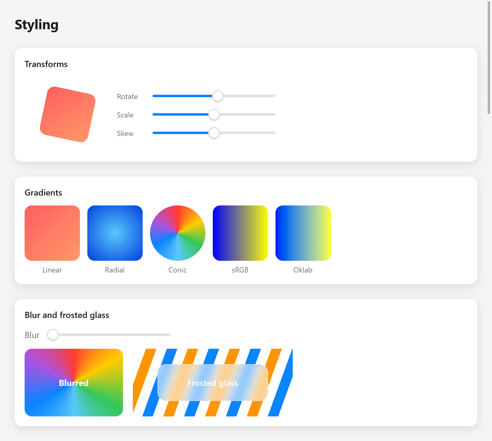
Rotation, gradients, blur and a frosted-glass backdrop rendered by myzig.
Transforms
Style.transform is a ui.Affine, an affine map of the plane as CSS's transform. It acts after layout: the box keeps its place, and its siblings don't move. It moves the box and everything in it, about Style.transform_origin (in fractions of the box; its center by default, .{ .x = 0, .y = 0 } its top left).
_ = c.leaf(.{
    .width = .{ .px = 80 }, .height = .{ .px = 80 }, .radius = 12,
    .background = c.theme.accent,
    .transform = ui.Affine.rotation(s.rotate).then(.scaling(s.scale, s.scale)).then(.skewing(s.skew, 0)),
}, .none, null);
The maps:
| function | CSS |
|---|---|
Affine.translation(x, y) | translate(x, y) |
Affine.scaling(sx, sy) | scale(sx, sy); negative values reflect |
Affine.rotation(degrees) | rotate(), clockwise on the screen |
Affine.skewing(x, y) | skew(), in degrees |
Affine{ .a, .b, .c, .d, .x, .y } | matrix(a, b, c, d, x, y) |
They compose in call order: a.then(b) is a, then b (m.translate(x, y), m.scale, m.rotate and m.skew are shorthands for m.then(...)). m.about(point) makes a map act about a point rather than the origin, m.apply(point) maps a point, m.inverse() is the map back (null for one that flattens the plane), and m.bounds(rect) the smallest rectangle holding a rectangle mapped. Quarter turns are exact.
A child's transform acts first, then its parent's. A box flattened to nothing (a scale of 0) shows nothing and takes no pointer.
The pointer follows what is drawn
Clicks, hover and drags reach a transformed box where it is drawn, not where the layout put it: a turned button is pressed inside its turned outline. Hit testing keeps each transformed box's own rectangle and the map from the window to it (src/ui/hit.zig).
How transforms are drawn
Most transforms only move boxes and scale them alike both ways (Affine.isSimilar). Those are folded into the boxes as they are painted, which stay plain boxes with round corners, so they cost nothing. Others (turns, slants, uneven scales) keep their boxes in the subtree's own coordinates and give them the transform, which the renderers read to draw each pixel from where it is in it (src/ui/paint_xf.zig). Text, borders, shadows and images of a slanted box are drawn slanted too.
Transforms are the cheapest thing to animate: animating one changes no layout. See Motion:
const s = ui.motion.to(c, "scale", if (hovered) 1.05 else 1, .snappy);Opacity and offset
Style.opacity fades a box and its content together. Style.offset moves a box after layout without moving its siblings, as a translation does, and also places an absolute box within its parent.
Gradients
Style.gradient points to a ui.Gradient, blended across the box over its background, within its rounded corners, as CSS's linear-gradient(), radial-gradient() and conic-gradient():
const sunset: ui.Gradient = .{
    .stops = &.{ .{ .color = .hex(0xff5e62), .at = 0 }, .{ .color = .hex(0xff9966), .at = 1 } },
    .angle = 135,
};
const ocean: ui.Gradient = .{ .kind = .radial, .stops = &.{
    .{ .color = .hex(0x5ac8fa), .at = 0 }, .{ .color = .hex(0x0040dd), .at = 1 },
} };

_ = c.leaf(.{ .width = .{ .px = 90 }, .height = .{ .px = 90 }, .radius = 12, .gradient = &sunset }, .none, null);| field | meaning |
|---|---|
kind | .linear (default), .radial or .conic |
stops | ui.Stops (color, at from 0 to 1), in order, at most Gradient.max_stops (16) |
angle | linear: degrees clockwise from upward; 180 (default) goes top to bottom, 90 left to right |
start | conic: where the turn starts, in degrees from upward (CSS's from) |
center | radial and conic: in fractions of the box |
radius | radial: the radius of the last stop in points; null reaches the farthest corner |
oklab | mix in Oklab, whose midpoints keep their lightness, rather than sRGB (CSS's in oklab) |
The first color shows before the first stop, the last after the last, and two stops at one place make a sharp edge. The gradient is kept until the frame is drawn: make it a constant, or put it in the app's memory or the frame's (c.alloc()), never on the stack of the view.
Blur
Style.blur blurs the box and its children as drawn, by a standard deviation in points (CSS's filter: blur()). The box is drawn into a layer of its own, which is blurred and drawn in its place, so it spreads past its edges.
_ = c.open(.{ .width = .{ .px = 160 }, .height = .{ .px = 110 }, .radius = 12,
    .gradient = &wheel, .blur = s.blur, .align_items = .center, .justify = .center }, null);
ui.text(c, "Blurred", .{ .weight = .bold, .color = .white });
c.end();
Backdrop effects
Style.effect points to a ui.Effect: the box draws from what is drawn under it, under its own background and children. With only blur, it is frosted glass (CSS's backdrop-filter: blur()):
const frost: ui.Effect = .{ .blur = 10 };

_ = c.open(.{ .width = .{ .px = 180 }, .height = .{ .px = 60 }, .radius = 14,
    .effect = &frost, .background = ui.Color.white.alpha(0.25),
    .border = ui.Color.white.alpha(0.5), .align_items = .center, .justify = .center }, null);
ui.text(c, "Frosted glass", .{ .weight = .semibold, .color = .white });
c.end();
At the place of the box in paint order, each renderer reads what it has drawn so far around the shape, blurs it (averaged down for large blurs, then a Gaussian along rows and columns, src/ui/backdrop.zig), and draws the box from it before drawing on.
Effects with a shader
An effect can also color its pane with a shader, a function of the pixel, the shape and the blurred backdrop, which it may sample anywhere (a lens bends what shows through it). A ui.effect.Shader has a name (each renderer compiles a shader once), its sources for the GPUs (hlsl, glsl, msl) and cpu, its CPU twin, which must draw the same pixels:
const Invert = struct {
    fn color(in: *const ui.effect.Input) [3]f32 {
        const b = in.sample(in.p[0], in.p[1]);
        return .{ 1 - b[0], 1 - b[1], 1 - b[2] };
    }
    const shader: ui.effect.Shader = .{ .name = "invert", .cpu = color };
};
const lens: ui.Effect = .{ .blur = 0, .shader = &Invert.shader };
The twin gets a ui.effect.Input: p, the pixel's center in the frame's pixels; rect (x, y, w, h) and radius of the shape in pixels; params, the effect's four [4]f32 parameters (Effect.params); and sample(x, y), the blurred backdrop there. The GPU sources define effect_color, whose arguments are the same:
HLSL, GLSL:  float3 effect_color(EffectIn i)                        (vec3 in GLSL)
Metal:       float3 effect_color(EffectIn i, texture2d<float> backdrop)
with backdrop_at(i, p) (in Metal backdrop_at(i, backdrop, p)) to sample. Writing the same effect three times and once more in Zig is a lot; the glass plugin is such an effect, and most apps write shaders once in ZSL instead (Shaders), which ui.shaderEffect turns into an effect.
ui.gpu_testing renders a view with a GPU renderer and the CPU one for a plugin's tests to compare them.
Clips
Style.clip clips a box's children to it, following its rounded corners. A scrolling box (scroll) clips too. A transformed box clips in its own coordinates, so a turned card's content stays inside the turned card.