
Empty, loading and alerts
These widgets give an app consistent states before content arrives, when there is nothing to show, and when the user needs a notice. They use the shared theme and renderer on every backend.
Empty content
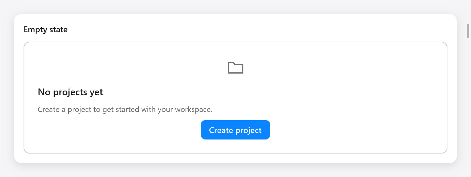
const state = ui.empty(c, "No projects yet", "Create your first project.", .{
    .icon = "folder",
    .outline = true,
});
defer state.end();
if (ui.button(c, "Create project", .{ .variant = .primary }).clicked) s.createProject();
ui.empty opens a column: add actions or custom content, then call end. EmptyOptions has width (.fill), icon ("") and outline (false). The title and description wrap, and the group is named for accessibility. Its buttons keep their own focus and actions. The app decides when it has no data and when to replace this state with content.
Skeleton placeholders
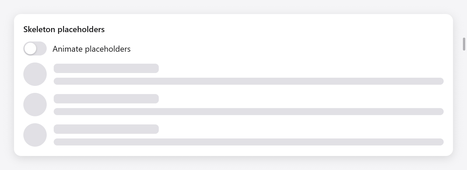
ui.skeleton(c, .{ .width = .{ .px = 40 }, .height = 40, .radius = 20 });
ui.skeleton(c, .{ .width = .{ .px = 180 } });
ui.skeleton(c, .{ .width = .fill, .height = 12 });
SkeletonOptions | Default | Meaning |
|---|---|---|
width | .fill | Placeholder width |
height | 16 | Height in points |
radius | 6 | Corner radius; half the size for a circle |
animated | true | A gentle pulse while waiting |
The pulse uses the UI clock and asks for frames at 30 Hz. It stops when animated is false or reduced motion is requested. Replace the placeholders once data arrives. They do not take focus or expose fictitious text to assistive technology; name the surrounding group when it needs an accessible loading status.
Inline alerts
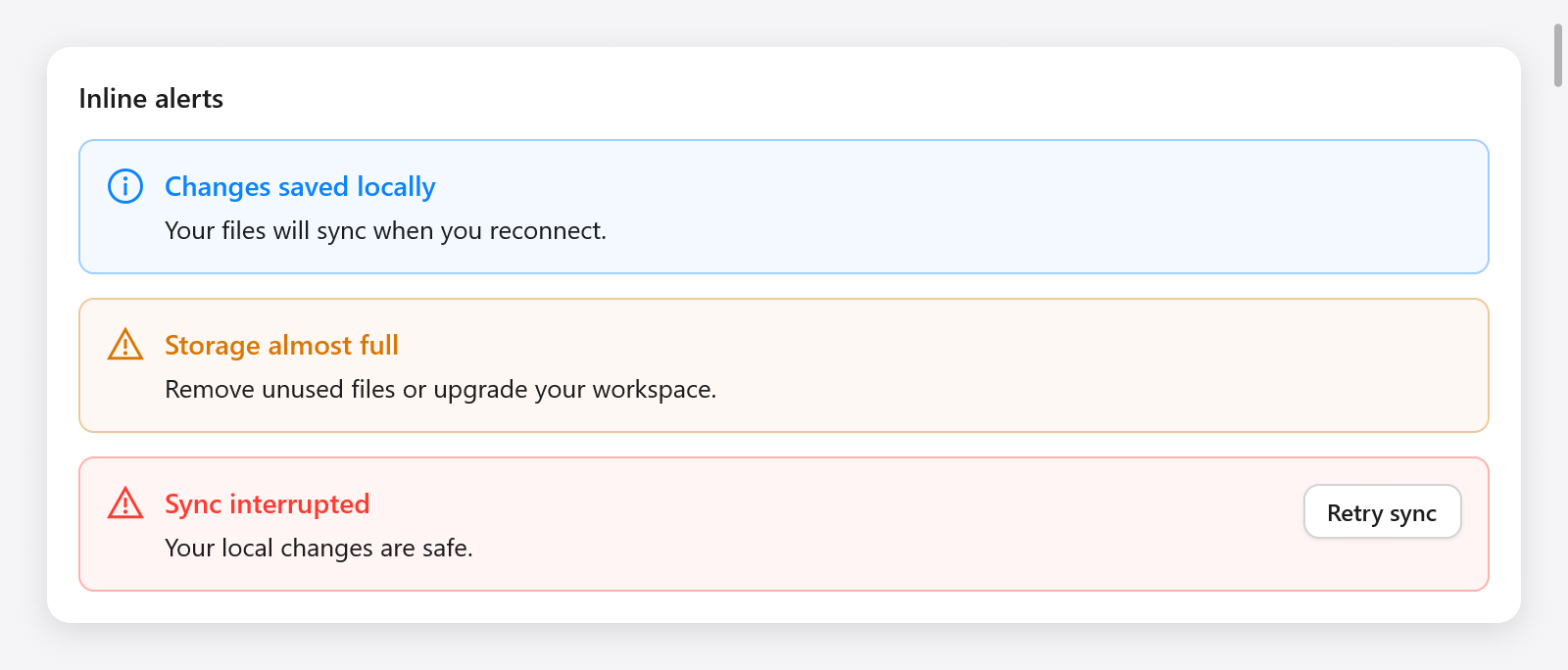
const notice = ui.alert(c, "Sync interrupted", "Your local changes are safe.", .{
    .kind = .danger,
});
defer notice.end();
if (ui.button(c, "Retry", .{}).clicked) s.retry();
ui.alert opens a row containing an icon and wrapping title/description. Add trailing actions before calling end. AlertOptions has width (.fill) and kind (.info): .info, .success, .warning or .danger. Colors follow the theme. An alert exposes an accessibility status group and leaves focus where the user put it. For a one-time screen-reader announcement, call c.announce when the app's state changes.
Use dialogs when a decision blocks further work and toasts for transient notices. The Feedback page in Gallery demonstrates all three widgets.