
Items
ui.item groups media, a title, a description and trailing actions into a content row. Use it for files, people, notifications and settings.
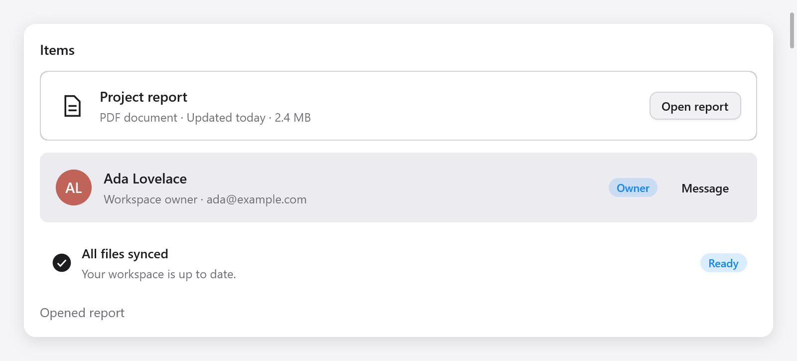
const row = ui.item(c, .{ .label = "Project report" });
defer row.end();
row.icon("doc.text");
row.content("Project report", "PDF document · Updated today");
if (ui.button(c, "Open", .{}).clicked) s.openReport();
The content takes the remaining width and wraps; actions keep their own width. Add ordinary widgets before or after content for custom media, badges or multiple buttons. A row is an accessibility group. Its controls are separate keyboard stops, so clicking an action does not activate the whole row.
Options and methods
ItemOptions | Default | Meaning |
|---|---|---|
width | .fill | Width of the row |
variant | .outline | .plain, .outline or .muted |
size | .normal | .normal or .small, controlling spacing and title size |
label | "" | Accessible name of the group |
| Method | Meaning |
|---|---|
icon(name) | A theme-colored icon in a fixed media slot |
avatar(name, options) | An existing ui.avatar, including image and initials fallback |
content(title, description) | A title and optional muted description; both wrap |
end() | Close the row after its trailing widgets |
const member = ui.item(c, .{ .variant = .muted, .size = .small });
defer member.end();
member.avatar("Ada Lovelace", .{ .size = 32 });
member.content("Ada Lovelace", "Workspace owner");
ui.badge(c, "Owner", c.theme.accent);
Give repeated items stable keys with ui.keyed(c, record.id) before ui.item, as for other list content. Row order follows the interface's text direction. The widget uses the shared layout and theme on macOS, Linux, Windows and browsers.
The Composition page in Gallery contains interactive examples. Combine items with pagination when the app loads data in pages.