
Button and toggle groups
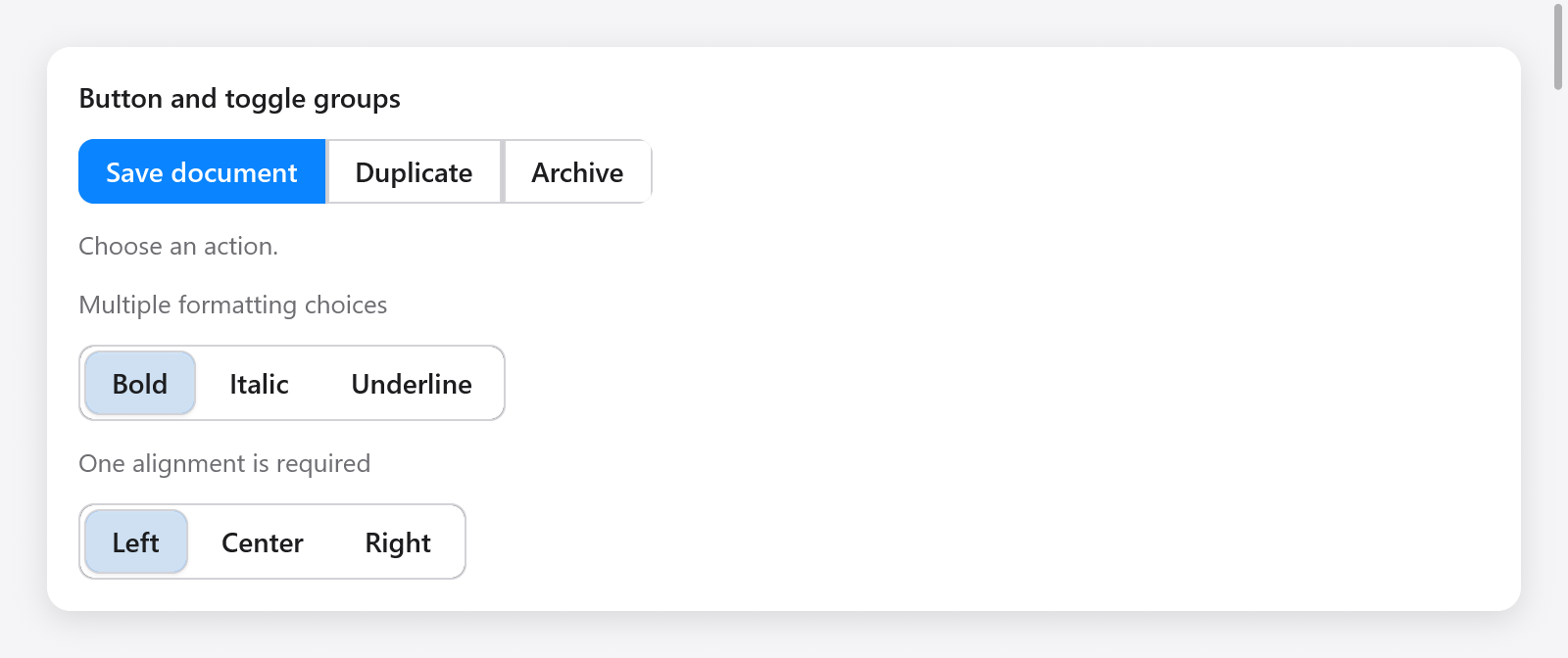
buttonGroup joins related actions. Close the group with end after adding its buttons:
var group = ui.buttonGroup(c, .{ .label = "Document actions" });
if (group.button("Save", .{ .variant = .primary })) save();
if (group.button("Duplicate", .{})) duplicate();
group.end();
ButtonGroupOptions accepts vertical, label and disabled. Each button also accepts the usual ButtonOptions. Disabled actions do not activate or take keyboard focus.
toggleGroup keeps one boolean per item in app-owned memory:
// State, retained between frames:
styles: [3]bool = .{ true, false, false },

// View:
_ = ui.toggleGroup(c, &.{
    .{ .label = "Bold" },
    .{ .label = "Italic" },
    .{ .label = "Underline", .disabled = true },
}, &s.styles, .{ .multiple = true, .label = "Formatting" });
Each ToggleGroupItem has a label, optional icon name and disabled flag. The default is single selection: initialize at most one selected flag. Set multiple = true to allow several. allow_empty = false keeps the last choice selected. The flags and items must have equal lengths.
Both groups form one Tab stop. Arrows, Home and End move focus, skipping disabled buttons; Space and Enter activate the focused button. Vertical groups use Up/Down, horizontal groups respect right-to-left layout. Toggle buttons expose their checked state to assistive technology.
See the Gallery's Actions & choices page and focus groups.