
Menus and selects
Menus drawn in the window by myzig: context menus opened by a right click, menus of a button, menu buttons, with items, check marks, shortcuts shown, separators and submenus; and selects, drop-downs choosing one of a list of strings. For the app's menu bar and the system's own context menus and tray menus, see Menus; for the commands an app offers as menu items, buttons and shortcuts at once, see Actions.
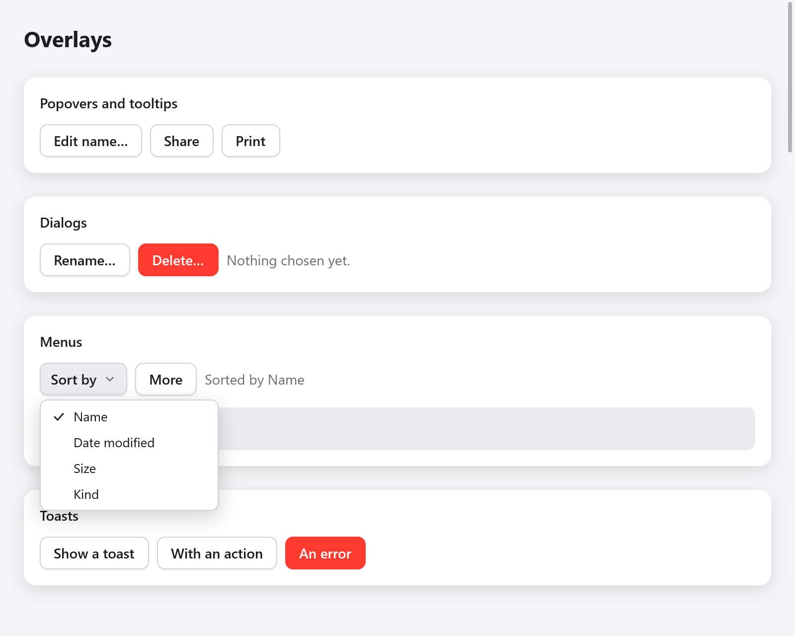
The Sort by menu is open, with Name selected.
A menu's state and items
A menu's state is a ui.Menu kept by the app, one per menu:
const State = struct {
    sort: ui.Menu = .{},
    more: ui.Menu = .{},
    ctx: ui.Menu = .{},
    sort_by: usize = 0,
    pinned: bool = false,
};
Every way of showing a menu returns a *ui.MenuPanel while it is open (null while closed). Its items are built while it is open; then its end:
if (ui.contextMenu(c, &s.ctx, row)) |m| {
    defer m.end();
    if (m.item("Rename", .{ .shortcut = "F2" })) s.rename.show();
    if (m.item("Pinned", .{ .checked = s.pinned })) s.pinned = !s.pinned;
    if (m.submenu("Move to")) |sub| {
        defer sub.end();
        for (folders) |f| if (sub.item(f, .{})) s.moveTo(f);
    }
    m.separator();
    if (m.item("Delete", .{ .disabled = s.locked })) s.alert.show();
}
MenuPanel.item(label, opts) is true in the frame the item is chosen (clicked, or Enter or Space on it), which closes the menu. ui.MenuItemOptions:
| Field | Default | |
|---|---|---|
shortcut | "" | a key combination shown by it, as the shortcut that does the same: it only shows it |
checked | null | a check mark by it when true, and room for one when false |
disabled | false | grayed out: it cannot be chosen |
icon | "" | an SF Symbol (or myzig's line icon of that name off macOS) before the label |
Write shortcuts with the Mac's symbols and let ui.keys.label write them as the platform does: ui.keys.label("⇧⌘S") is ⇧⌘S on macOS and Ctrl+Shift+S on Linux and Windows. An item only shows its shortcut; answer the keys themselves with c.shortcut(...), or name the command once as an action, whose menu item shows its shortcut and answers it.
separator() draws a line between groups of items. submenu(label) adds an item that opens a submenu as the pointer rests on it, or for Right or Enter; it returns the submenu's panel while it is open. Submenus go four deep (max_depth in src/ui/menu.zig), and the keyboard moves among the first 64 items of a menu.
Up and Down move among the items (skipping disabled ones), Right and Left open and close submenus, and Escape closes the innermost menu. As the system's menus do, an open menu takes the press outside it, which closes it and goes no further. The pointer highlights an item only when it moves, so a menu opening under a resting pointer keeps the keyboard's highlight.
Context menus
ui.contextMenu(c, &menu, target) gives the element target (an interaction of its box, built with its children) a menu that opens where it is right-clicked, or below it for Shift+F10 while it has the focus:
const row = ui.pressable(c, .{ .width = .fill, .padding = .all(12), .radius = 8, .background = c.theme.surface_hover }, null);
ui.text(c, "A note (right click me)", .{});
ui.end(c);
if (ui.contextMenu(c, &s.ctx, row)) |m| {
    defer m.end();
    if (m.item("Rename", .{})) s.rename.show();
}
Call it after the elements inside target, so that the innermost element with a menu takes the click: a list's row with a menu of its own, inside a list with one for its background.
Menus of a button
ui.buttonMenu(c, &menu, button) gives a button a menu, which opens below it as the pointer goes down on it (as the system's pop-up buttons do, so a press, a drag to an item and a release choose it) and closes for a second press:
const more = ui.button(c, "More", .{});
if (ui.buttonMenu(c, &s.more, more)) |m| {
    defer m.end();
    if (m.item("Duplicate", .{ .shortcut = ui.keys.label("⌘D") })) s.duplicate();
    if (m.item("Export…", .{})) s.exportIt();
}
ui.menuButton(c, title, &menu, opts) is a button of its own showing title and an arrow, opening the menu below it: as the pointer goes down on it, or for Enter, Space or Down while it has the focus.
if (ui.menuButton(c, "Sort by", &s.sort, .{})) |m| {
    defer m.end();
    for (sorts, 0..) |by, i| if (m.item(by, .{ .checked = s.sort_by == i })) {
        s.sort_by = i;
    };
}
ui.MenuButtonOptions has size (14), disabled and width (.auto).
Opening a menu from code
ui.menu(c, &menu) builds the menu menu wherever it was opened, and is what the functions above call. Open it with Menu.openAt(point) (its top left corner at a point of the window) or Menu.openBelow(rect) (below a rectangle, or above it where there is no room), and close it with close(); isOpen() tells whether it is open.
if (c.shortcut(.{ .key = 'k', .cmd = true })) s.palette.openAt(.{ .x = 200, .y = 80 });
if (ui.menu(c, &s.palette)) |m| {
    defer m.end();
    if (m.item("New note", .{})) s.newNote();
}
Selects

Closed select, combobox and autocomplete controls.
ui.select(c, &selected, options, &state, opts) is a drop-down choosing one of options (strings) into selected.*, an index. Its state is a ui.SelectState kept by the app:
const sizes = [_][]const u8{ "Small", "Medium", "Large" };
// In the app's state: size: usize = 1, size_box: ui.SelectState = .{},

if (ui.select(c, &s.size, &sizes, &s.size_box, .{ .width = .{ .px = 160 } }).changed) s.save();
A click on it, or Enter, Space, Up or Down while it has the focus, opens its options below it (above where there is no room); the arrows, Home and End move among them, Enter, Space or a click chooses one, and Escape or a press outside closes them, which the list takes, as the system's pop-up menus do. The focus comes back to the select. With more options than the window has room for, the list is as tall as the room on the larger side of the select, and its options scroll.
ui.SelectOptions:
| Field | Default | |
|---|---|---|
width | .{ .px = 200 } | |
size | 14 | the font size |
placeholder | "Choose…" | shown when selected.* is past the options |
disabled | false | |
label | "" | names it for assistive technology |
ui.SelectResult has changed (a new option was chosen in this frame), open and focused.
For a field whose text filters the options as the user types, use ui.combobox; for suggestions under a free text field, ui.autocomplete (both in Text input).