
Date range picker
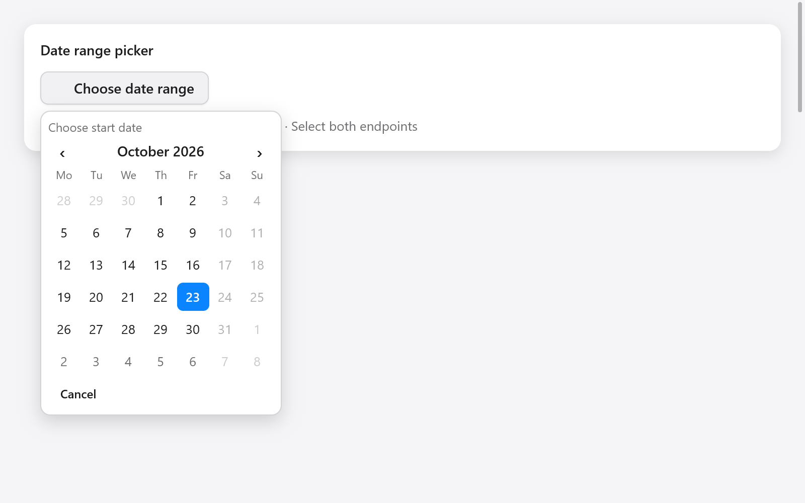
dateRangeInput commits an inclusive DateRange after the user chooses both endpoints. Picking the later day first is supported; the resulting start is always on or before end.
// App state:
period: ?ui.DateRange = null,
period_picker: ui.DateRangeState = .{},

// View:
_ = ui.dateRangeInput(c, &s.period, &s.period_picker, .{
    .label = "Reporting period",
    .format = .day_month_year,
    .calendar = .{
        .min = .{ .year = 2026, .month = 10, .day = 1 },
        .max = .{ .year = 2026, .month = 12, .day = 31 },
        .first_weekday = 1,
    },
});
CalendarOptions now supports inclusive min/max and disabled: ?*const fn (ui.Date) bool. These also work with calendar and dateInput. A range cannot include any disabled day, even between its endpoints. If a callback is supplied, validation visits each day in the chosen range; keep it inexpensive.
The popup shades the pending range. A first click does not change the committed value. Cancel, Escape or a press outside leaves that value unchanged; reopening starts a fresh choice. Set disabled = true to lock the input. No allocator is required.
Arrows move by days/weeks, Page Up/Down by months, Home/End to the month's edges; Enter or Space chooses the current day. Disabled days may be visited by the cursor but cannot be chosen. The function returns true only after a different complete range is committed.
See dates, times and colors and Gallery's Actions & choices page.