
Structures
The widgets that give a window its shape: tabs, disclosures and accordions, split views, sidebars, toolbars and breadcrumbs. Lists, trees, outlines, tables and grid views are on Lists; the grid layout is on Grid.
These widgets follow one pattern: the choice they make is the app's (an index, an id, a bool, a size), passed by pointer, and those that hold other content open a box that the view fills, then closes with end. Their end (or the call itself) returns what happened in this frame: changed when a click or a key changed the app's value, and focused when they have the keyboard focus.
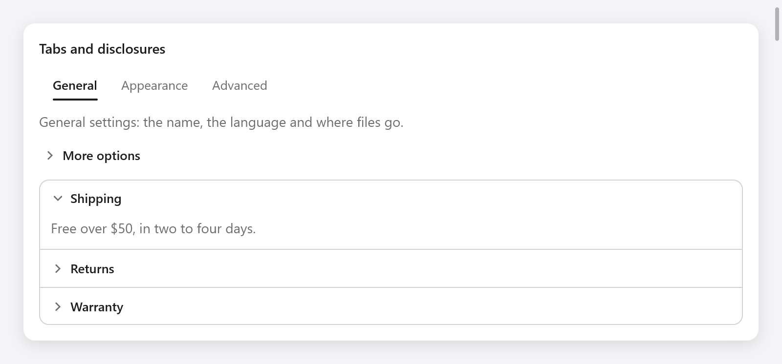
Tabs, a disclosure and an accordion with the Shipping section expanded.
Tabs
ui.tabs(c, labels, &selected, opts) is a row of labels of which one is chosen, over the page the view builds for it:
if (ui.tabs(c, &.{ "General", "Appearance", "Advanced" }, &s.tab, .{}).changed) s.save();
switch (s.tab) {
    0 => s.general(c),
    1 => s.appearance(c),
    else => s.advanced(c),
}
A click chooses a tab, as do the arrows, Home and End while the tab bar has the keyboard focus, which a click gives it. ui.TabsOptions has width (.fill) and size (13, the font size).
The bar takes one Tab stop; Shift+Tab leaves it in reverse order. An empty bar takes no keyboard focus and keeps the supplied selection unchanged. For a nonempty list, an out-of-range selection is clamped to its last tab and reports changed, including when tabs are removed. Left/Right follow the layout direction (reversed in RTL); modified keys remain available to the app's shortcuts.
For pages that are places the user goes to, with a history and back and forward, use a router.
Disclosures
ui.collapsible(c, title, &open) is a header, title beside an arrow, that opens and closes what the view builds below it. The content grows into view and shrinks away; build it while the disclosure's shown is true (open, or still closing), then end:
const d = ui.collapsible(c, "More options", &s.advanced);
defer d.end();
if (d.shown) {
    _ = ui.checkbox(c, "Verbose logging", &s.verbose);
    _ = ui.checkbox(c, "Experimental features", &s.experimental);
}
A click on the header opens and closes it, as do Enter and Space while it has the keyboard focus. The ui.Disclosure also has changed (the header was pressed in this frame), progress (from 0 closed to 1 open, easing toward the state, for content that animates itself), focused and id.
Accordions
ui.accordion(c, opts) is a bordered box of sections one above the other, each a disclosure opening on its own. Add each with Accordion.item(title, &open), which returns its Disclosure:
var acc = ui.accordion(c, .{});
defer acc.end();
const titles = [_][]const u8{ "Shipping", "Returns", "Warranty" };
const bodies = [_][]const u8{ "Free over $50.", "Within 30 days.", "Two years." };
for (titles, bodies, 0..) |title, body, i| {
    const it = acc.item(title, &s.sections[i]);
    defer it.end();
    if (it.shown) ui.text(c, body, .{ .color = c.theme.muted });
}
Up and Down move the focus between the headers, Home and End to the first and the last. ui.AccordionOptions has width (.fill). For an accordion where one section is open at a time, close the others when one opens: if (it.changed and s.sections[i]) for (&s.sections, 0..) |*o, j| if (j != i) o.* = false;.
Split views
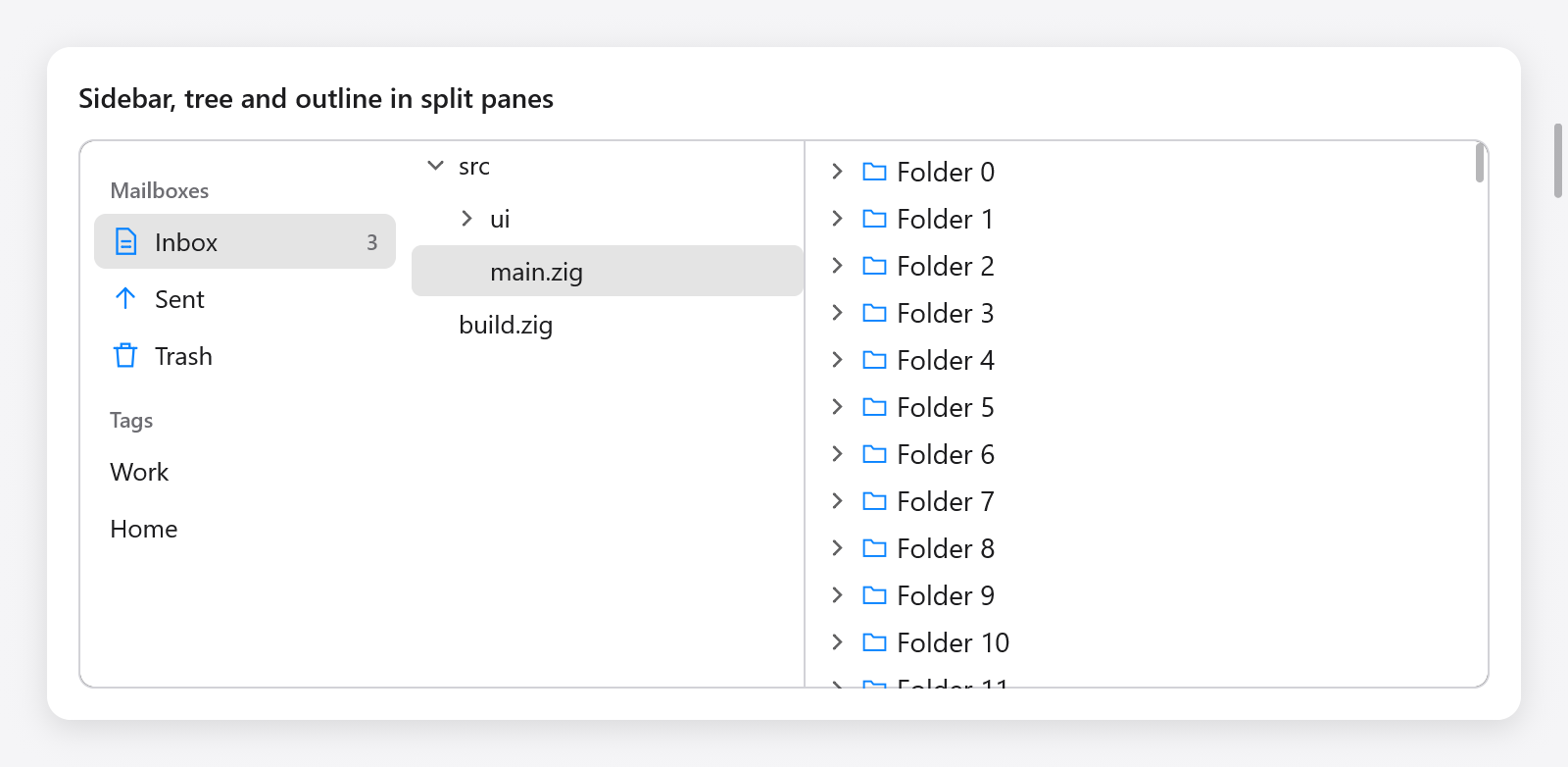
Sidebar, file tree and virtual outline arranged in split panes.
ui.split(c, &size, opts) puts two panes side by side (or one above the other, vertical), with a divider between them that the pointer drags to resize them (showing a resize cursor), or the arrows move once it has the focus. It opens the first pane; second() closes it, adds the divider and opens the second; end() closes the split and returns a result:
var sp = ui.split(c, &s.sidebar_width, .{ .min = 120 });
s.files(c);
sp.second();
s.editor(c);
if (sp.end().changed) s.saveLayout();
size.* is the first pane's width (its height when vertical) in points, or, with percent, its share of the room from 0 to 100, so both panes grow with the window. The divider keeps min points from either edge; when the window leaves less room, the first pane gives way and takes its size back when there is room again: size.* keeps what the user chose.
ui.SplitOptions:
| Field | Default | |
|---|---|---|
vertical | false | one pane above the other |
percent | false | size.* is a percentage of the room |
min | 40 | the least room either pane keeps |
width, height | .fill | the split's box |
step | 10 | how far the arrows move the divider |
grip | 8 | how wide the divider is to the pointer, across its line |
The result has changed (a drag or a key moved the divider), dragging and focused. Splits nest: a pane can hold another split.
Sidebars
ui.sidebar(c, &selected, opts) is a source list as Finder's and Mail's: items with icons in sections, choosing one item's id into selected.* (a []const u8 the app keeps). Add sections and items, then end:
var sb = ui.sidebar(c, &s.mailbox, .{ .width = .{ .px = 170 } });
if (sb.section("Mailboxes", &s.mailboxes_shown)) {
    sb.item("inbox", "Inbox", .{ .icon = "doc.text", .badge = "3" });
    sb.item("sent", "Sent", .{ .icon = "arrow.up" });
    sb.item("trash", "Trash", .{ .icon = "trash" });
}
if (sb.section("Tags", null)) {
    sb.item("work", "Work", .{});
    sb.item("home", "Home", .{});
}
if (sb.end().changed) s.showMailbox();
section(title, open) adds a section title, a click on which hides and shows its items; it returns whether they show (always, for a null open). item(id, label, opts) adds an item choosing id, which the app keeps while it shows; ui.SidebarItemOptions has icon (an SF Symbol, or myzig's line icon off macOS) and badge (a count or a word at the end of the row). It scrolls when its items do not fit.
A click chooses an item; while the sidebar has the focus, Up, Down, Home, End and the first letters of an item's label choose among them. The item chosen shows in the accent color while the sidebar has the focus, in gray otherwise, as AppKit's do. ui.SidebarOptions has width (.{ .px = 220 }), height (.fill) and background (null: the theme's).
Toolbars
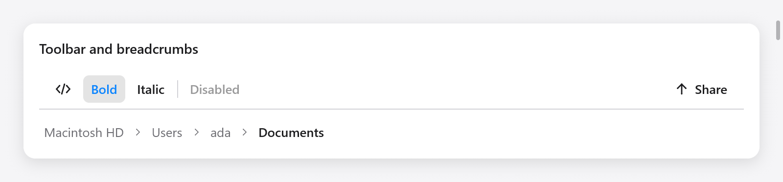
Toolbar actions and a breadcrumb trail.
ui.toolbar(c, opts) is a row of controls along the top of a window or a pane, which take no face of their own until hovered. A toolbar is one stop of the keyboard: a click on a control gives it the focus, Left and Right then move among its controls, Home and End to the first and the last, and Enter or Space presses the one shown (as a focus group does for other controls):
var tb = ui.toolbar(c, .{});
_ = tb.button("", .{ .icon = "chevron.left.forwardslash.chevron.right" });
_ = tb.toggle("Bold", &s.bold);
_ = tb.toggle("Italic", &s.italic);
tb.separator();
_ = tb.button("Disabled", .{ .disabled = true });
tb.spacer();
if (tb.button("Share", .{ .icon = "arrow.up" })) s.share();
tb.end();
button(title, opts)is true when clicked (or pressed with the keys); its options areicon, before the title or alone when the title is empty, anddisabled.toggle(title, &value)stays down whilevalue.*is true, and is true in the frame it toggles;toggleIcon(title, icon, &value)shows an icon, with the title for assistive technology.spacer()pushes the controls after it to the end;separator()draws a thin vertical line between groups.
ui.ToolbarOptions has width (.fill), height (40) and border (a line under it, true). In a window whose title bar is hidden, make c.title_bar_height the toolbar's height, so that dragging its empty room moves the window (see Windows).
Breadcrumbs
ui.breadcrumbs(c, items, &chosen, opts) shows a path of places, each a link but the last, which is where the user is. It returns true in the frame a link was chosen, its index in chosen.*:
const path = [_][]const u8{ "Macintosh HD", "Users", "ada", "Documents" };
if (ui.breadcrumbs(c, &path, &s.crumb, .{})) s.goUp(s.crumb);
ui.BreadcrumbsOptions has size (13) and max_item_width (200): longer items are clipped.