
Pagination
ui.pagination chooses a page independently of a table, list or grid. The app owns the page number and loads or slices its data when it changes. Virtualization limits rendered rows; pagination limits the data loaded.
// In app state: page: usize = 1,
if (ui.pagination(c, &s.page, .{ .page_count = 20 })) {
    s.loadPage(s.page);
}
page is one-based. A known zero-page result sets it to zero and disables both navigation buttons. Otherwise it is clamped into the valid range. The function returns true whenever the value changes, including normalization after the total shrinks. Loading should be asynchronous: do not block the main thread in a view.
Known and unknown totals
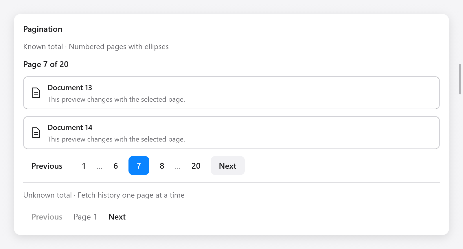
Numbered mode shows the first page, last page, current page, its neighbors and ellipses for skipped ranges. Small ranges show every page. Its work is bounded independently of the total number of pages.
For an API without a total, leave page_count null and set has_next from the response:
_ = ui.pagination(c, &s.history_page, .{
    .has_next = s.next_cursor != null,
    .disabled = s.loading,
    .label = "History pages",
});
This mode shows Previous, the current page label and Next. The app keeps the cursors or cached pages needed to go back; the widget handles navigation only. has_next is ignored when page_count is known.
PaginationOptions | Default | Meaning |
|---|---|---|
page_count | null | Known total, or null for unknown total |
has_next | false | Another unknown-total page is available |
siblings | 1 | Numbered neighbors on each side, from 0 to 3 |
disabled | false | Disable all navigation, for example during loading |
label | "Pagination" | Accessible name of the group |
previous_label | "Previous" | Previous button text |
next_label | "Next" | Next button text |
page_label | "Page" | Prefix for accessible page names and the unknown-total label |
Keyboard and accessibility
- Tab enters the group at the current page on first use and leaves in one step. Returning remembers the last focused control.
- Left/Right move focus between enabled controls; Home/End go to the first or last control. They do not load a page until activated.
- Enter/Space activate the focused control. Disabled controls and ellipses are skipped. Right-to-left layout reverses the horizontal arrows.
- Number buttons expose names such as “Page 6” and the selected state. Override the labels to localize the widget.
If a total or neighbor count changes and removes the focused button, focus moves to the current page, or the first enabled control in unknown-total mode. An empty or disabled pager clears its own focus.
For narrow layouts, use fewer siblings or place the pager in a horizontal scrolling row. It does not automatically wrap its controls.
See Gallery, items and lists, trees and tables.