
Command palette
ui.commandPalette provides searchable commands in a modal dialog. It returns the original index in the app's items when a command is activated.
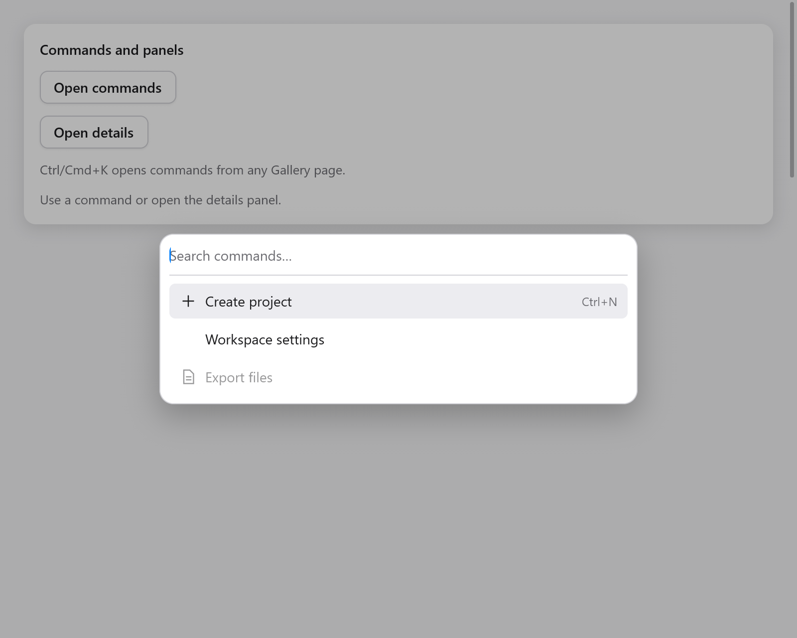
// In app state: commands: ui.CommandState = .{},
if (c.shortcut(.{ .key = 'k', .cmd = true })) s.commands.toggle();
const items: []const ui.CommandItem = &.{
    .{ .title = "New file", .group = "Files", .keywords = "create", .icon = "doc.text" },
    .{ .title = "Settings", .group = "Application", .keywords = "preferences" },
    .{ .title = "Export", .group = "Files", .disabled = !s.has_files },
};
if (ui.commandPalette(c, &s.commands, items, .{})) |index| s.runCommand(index);
Keep CommandState in app state. show, close and toggle control its overlay; query is its search buffer and selected the active original item index. Each reopening clears the query. Build the palette after the rest of the view so its controls have the last chance to handle input.
Items and options
An item has title, optional group, keywords, icon, shortcut (display text) and disabled. Place items of a group together. Search matches title and keywords, ignoring ASCII case; prefix matches come first. The palette displays disabled matches and skips them during navigation.
CommandOptions | Default | Meaning |
|---|---|---|
width | .{ .px = 480 } | Dialog width, capped to the window |
max_height | 320 | Maximum results height before scrolling |
label | "Commands" | Accessible dialog/list name |
placeholder | "Search commands…" | Search hint |
search_label | "Search commands" | Accessible search-field name |
empty_label | "No commands found." | Text for an empty result |
Typing keeps the search field focused. Up/Down wrap through enabled matches; Home/End go to the first/last. Enter activates the current match, and a pointer click activates a result. Space remains ordinary search text. The active result scrolls into view and is exposed to assistive technology as the search field's active descendant.
Tab stays inside the dialog. Escape or a click on its backdrop closes it; activation closes it too. Closing restores the trigger's focus. This frequently used menu opens without an entrance animation.
Shared actions
When the app already uses ui.Actions, use the adapter to share titles, icons, enabled states and shortcut labels:
if (s.actions.commandPalette(c, &s.commands, .{})) |cmd| s.run(cmd);It returns the action's enum tag and updates actions.last, like menuItem and button. Shortcut labels are presentation; continue to use actions.shortcuts(c) to dispatch those key combinations.
See Gallery for commands opening a Sheet or updating the workspace.