
Layout
Layout is flexbox, as in CSS: a box lays out its children in a row or a column, sizes them from their content, shares the free room among those that grow, and aligns them along both axes. Every box is described by one ui.Style, given to ui.row, ui.column and the other containers, or set with the methods of ui.div.
Layout runs every frame, in two passes: measure sizes boxes from their content, bottom up; arrange places them, top down. Text layouts are cached across frames, so a frame that changes nothing in a box costs little to lay out again.
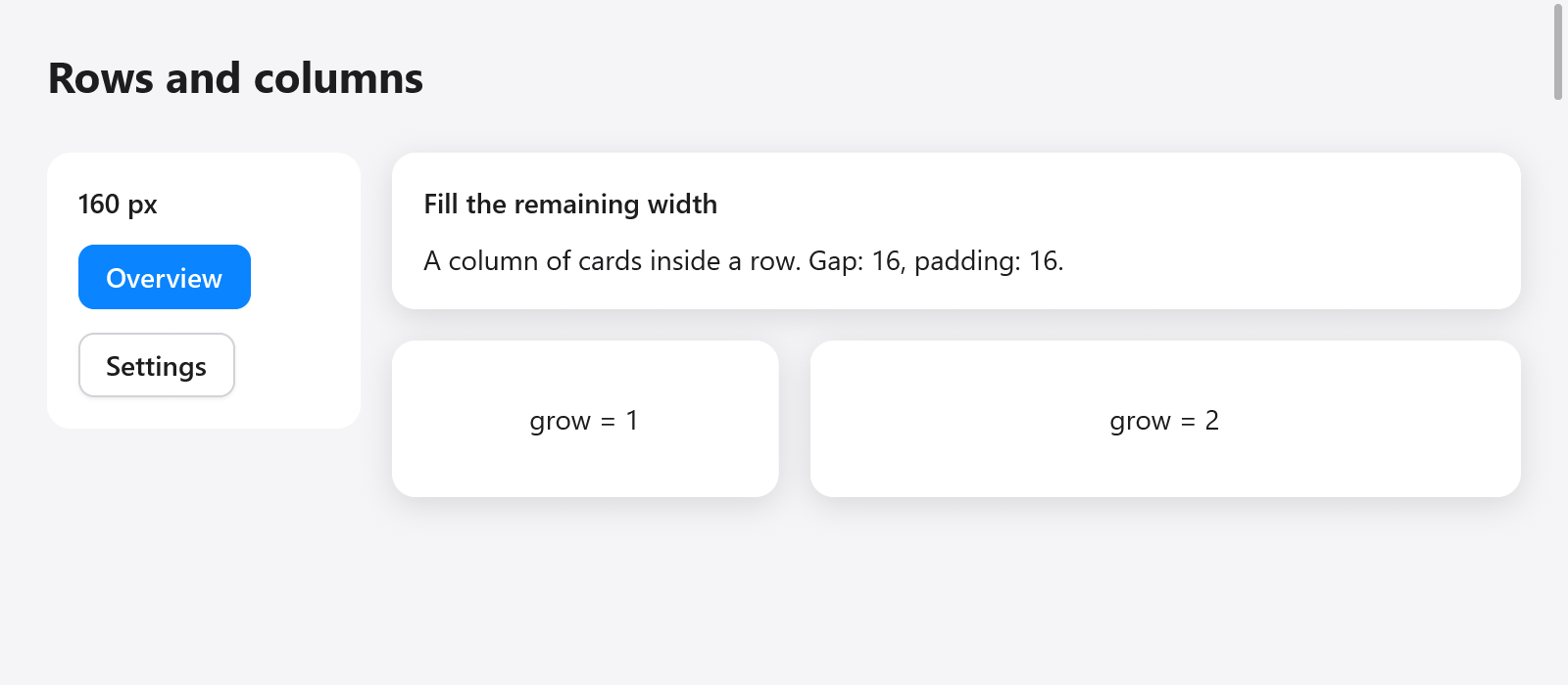
A fixed-width sidebar beside a flexible column of cards, with gaps and padding.
Containers
| function | what it opens |
|---|---|
ui.column(c, style) | children top to bottom |
ui.row(c, style) | children left to right (right to left in RTL) |
ui.card(c, style) | a column on the surface color, rounded 12, padded 16, with a soft shadow, unless the style says otherwise |
ui.scroll(c, style) | a column whose children scroll vertically |
ui.pressable(c, style, hover) | a box that reports the pointer (see custom widgets) |
ui.div(c) | a column styled by a chain of methods, see below |
Each is closed by ui.end(c) (a ui.Div by its own end). ui.spacer(c) takes the free room along its parent's main axis, pushing what follows to the end, and ui.divider(c) draws a one-point line across its parent in the border color.
ui.row(c, .{ .width = .fill, .padding = .xy(16, 10), .gap = 8, .align_items = .center });
defer ui.end(c);
ui.text(c, "Inbox", .{ .weight = .semibold });
ui.spacer(c);
_ = ui.button(c, "Compose", .{ .variant = .primary });
Sizes
width and height are a ui.Length:
.auto, the default: as large as the content (plus padding)..{ .px = 120 }: exactly that many points..fill: all the room the parent gives. Along the parent's main axis it grows asgrow = 1does from its padding; across it, it stretches.
min_width, min_height, max_width and max_height bound the size. A max_width keeps prose readable in a wide window; a max_height on a scrolling box makes it as tall as its content up to that height, then scroll (a chat's answer, a popover's list).
grow is a box's share of the free room along its parent's main axis: two siblings with grow = 1 and grow = 2 take a third and two thirds of it. The room is shared as CSS flexbox shares it, and Chrome lays it out: each box grows from its size (its flex base size, before its minimum and maximum), a box its max_width or min_width stops keeps that size, and the others share what is left. A box is never smaller than its padding, whatever its size says.
When a row has too little room, boxes holding wrapping text give theirs back, in proportion to their widths less their padding, down to their min_width, and their text wraps onto more lines. Other boxes keep their size. A box whose final width differs from the width it was measured at is measured again, so wrapped text always gets the right number of lines.
Spacing
padding is a ui.Edges (top, right, bottom, left), with ui.Edges.all(12) and ui.Edges.xy(16, 8) (horizontal, vertical) for the common cases; in a struct literal, .padding = .all(12). gap is the room between children along the main axis. There are no margins: space boxes with their parent's gap and padding, or a ui.spacer.
Alignment
align_items places children across the main axis: .start (the default), .center, .end, .stretch, which makes children whose cross size is .auto as wide (in a column) or as tall (in a row) as the box, or .baseline, which lines up the first lines of text of a row's children, as a large price beside its small unit, the row as high as that takes. The baseline of a box is that of its first child as it starts the box (of a row lining up its children, of their line), and a child without text lines up its bottom, as in CSS; across a column .baseline is .start:
ui.row(c, .{ .align_items = .baseline, .gap = 4 });
defer ui.end(c);
ui.text(c, "$42", .{ .size = 40, .weight = .bold });
ui.text(c, "/month", .{ .color = c.theme.muted });
A form's rows line up their labels with their controls' text by baselines = true (see forms).
justify places them along it when none grows: .start, .center, .end, or .space_between, which spreads the free room between them.
// Centered both ways in the window.
ui.column(c, .{ .width = .fill, .height = .fill, .align_items = .center, .justify = .center, .gap = 12 });
defer ui.end(c);
Scrolling
A box with scroll = true (as ui.scroll makes) clips its children and scrolls them vertically with the wheel and the trackpad; a thin scroll bar, which its thumb drags, shows at its right while its content overflows (scrollbar = false scrolls it without one). A notch of a mouse wheel glides there over a short ease out, as browsers scroll it, notches in a row adding up, and a box at its end leaves them to the box around it; a touchpad follows the fingers, and with less motion a notch scrolls at once. A scrolling box takes the room it is given, not its content's height (as CSS's min-height: 0), so give it a size or let it grow:
ui.scroll(c, .{ .grow = 1, .width = .fill, .padding = .all(16), .gap = 8 });
defer ui.end(c);
for (s.messages) |m| messageRow(c, m);
A row with scroll = true scrolls sideways instead, as a strip of tabs: it takes the width it is given rather than its content's, the wheel moves it along, and a thin bar shows along its bottom while its content overflows. Set c.scroll for its id to bring a child into view. c.scroll_limit.get(id) is how far each scrolling box laid out in the last frame can scroll (0 where its content fits or it is empty), whether layout measured its texts anew or kept them; c.scroll_max is kept only for boxes that follow their end (below), so read scroll_limit for the others. c.glideBy(id, dy) glides box id by dy points (up positive), as a notch over it would, for what scrolls a box from elsewhere: a minimap, an overview.
With follow_end = true a scrolling box stays at its end as its content grows, while the reader left it there: logs, chats and terminals. Scrolled up, it stays put; scrolled back down, it follows again. c.capScroll(id, offset) lets it follow no further than an offset for a frame, and c.scrollMoved(id) tells whether the reader or the app moved it rather than following.
follow_glide makes it glide to its end as its content grows, as an animation says, rather than show the end at once: what is added comes up from below, as the chat apps scroll. On the frame the content changes, the children that stay show where they showed, then go to their place; a glide on its way goes on from where it is as more comes, the reader scrolling stops it, and with less motion the end shows at once. Content that fits the box with justify = .start moves nothing, nor does a box as tall as its content (max_height); a box whose height changes by itself (a window resized, a composer below grew) moves its children at once.
const glide: ui.FollowGlide = .of(.smooth);
ui.column(c, .{ .scroll = true, .follow_end = true, .follow_glide = &glide, .grow = 1, .gap = 8 });
For thousands of rows, use the virtual list ui.list, which builds only the rows in view; see lists.
Positioning
offset moves a box after layout, without moving its siblings: a nudge, a press that sinks a button by half a point, a drag.
absolute = true takes a box out of the flow: it is placed at its parent's content origin (plus offset), at its own size (.fill fills the parent's content box), over or under its siblings by the order built. Badges on icons and handles over pictures are absolute boxes:
ui.column(c, .{ .width = .{ .px = 48 }, .height = .{ .px = 48 } });
defer ui.end(c);
ui.icon(c, "folder", .{ .size = 40 });
{
    ui.row(c, .{ .absolute = true, .offset = .{ .x = 30, .y = -4 } });
    defer ui.end(c);
    ui.badge(c, "3", c.theme.danger);
}
Things that float over everything (popovers, menus, toasts) are overlays, laid out above the view; see overlays.
transform moves, scales and turns a box as drawn, about transform_origin, after layout: its place in the flow stays. See transforms.
Clipping and opacity
clip = true clips a box's children to it, following its rounded corners. opacity fades a box and everything in it together.
The chain of ui.div
ui.div(c) opens a column and returns a ui.Div, whose methods each set one field of its style and return it, so they chain, as GPUI's elements do. Style methods come first, then the children, then end:
const item = ui.div(c).row().wFull().px(10).py(6).gap(8).itemsCenter().rounded(7).hover(c.theme.surface_hover);
defer item.end();
if (item.clicked()) s.page = .settings;
ui.icon(c, "wrench.and.screwdriver", .{ .size = 14 });
ui.text(c, "Settings", .{ .weight = .medium });| methods | style |
|---|---|
row(), column() | direction |
gap(v) | gap |
p(v), px(v), py(v), pt(v), pr(v), pb(v), pl(v) | padding: all, horizontal, vertical, one side |
w(v), h(v), size(w, h) | width, height in points |
wFull(), hFull(), sizeFull() | .fill |
grow() | grow = 1 |
minW(v), maxW(v), maxH(v) | bounds |
itemsStart(), itemsCenter(), itemsEnd(), itemsStretch() | align_items |
justifyCenter(), justifyEnd(), justifyBetween() | justify |
center() | both, centered |
bg(color), border(color), borderW(v) | background, border |
rounded(v), roundedFull() | radius |
shadow(s), shadowSm(), shadowMd(), shadowLg() | shadow |
opacity(v) | opacity |
clip(), scrollY(), absolute(), offset(x, y) | overflow and position |
control() | control: its texts do not select |
hover(color) | the background eases to color under the pointer |
interaction(), clicked() and hovered() read how the pointer relates to the box, from the last layout; clicked() also sets c.changed, so what the click changes shows in this frame.
Grids
Rows and columns that line up across each other (a form of labels and fields, a dashboard of cards) are a grid of tracks; see grid layout.