
Multi-select
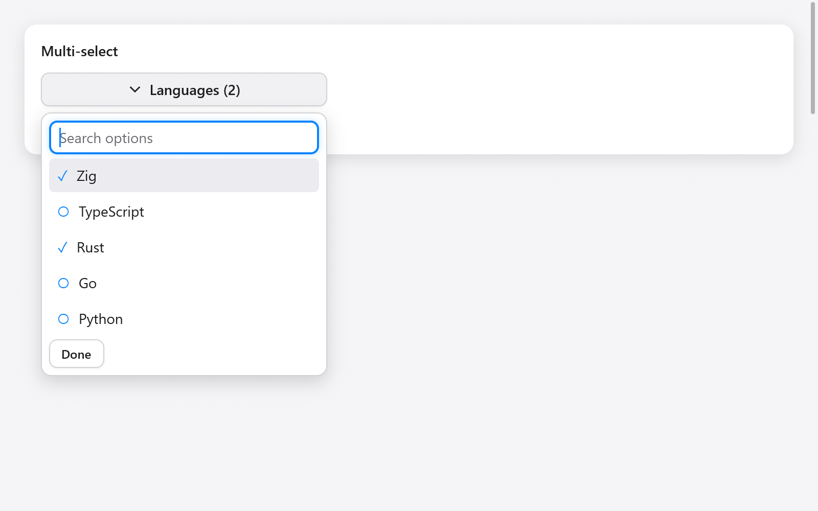
multiSelect combines a search field with a persistent list of checked choices. Search changes the visible options, preserving original indices and choices outside the current filter.
// App state:
languages: [3]bool = .{ true, false, false },
language_picker: ui.MultiSelectState = .{},

// View:
if (ui.multiSelect(c, &s.language_picker,
    &.{ "Zig", "TypeScript", "Rust" }, &s.languages,
    .{ .label = "Languages" },
)) savePreferences();
Keep the state and boolean flags between frames. The options and flags must have equal lengths; indices identify options, so remap the flags if you reorder the options. No allocator or deinitialization is required.
MultiSelectOptions includes label, search placeholder, empty_label, width, max_height, disabled, and optional disabled_items flags parallel to the options. Existing disabled choices stay selected but cannot be changed through the widget.
Typing filters without case sensitivity. Up/Down skip disabled options; Home/End move to the edges; Enter toggles the active option. Clicking an option keeps the popup open and returns focus to search. Done, Escape or a press outside closes it. Closing with Escape restores the trigger's focus. The return value is true only when a selection changes.
See Actions & choices in Gallery, and single-choice comboboxes.