
Input groups
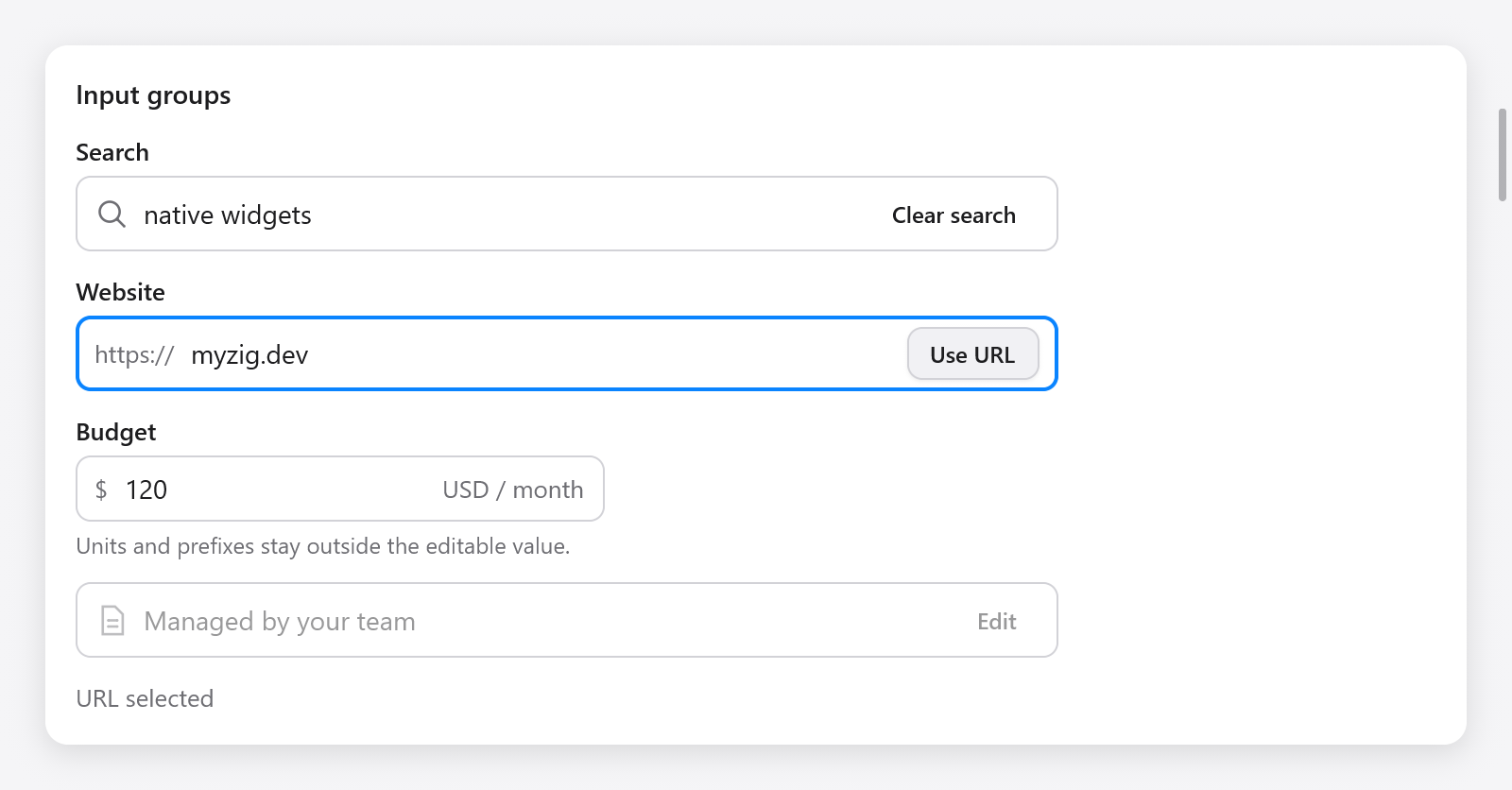
ui.inputGroup puts one text field, icons, prefixes, suffixes and action buttons inside a shared frame. Its input uses the same editing, selection, input methods and password handling as text fields.
var group = ui.inputGroup(c, .{ .width = .{ .px = 420 } });
defer group.end();
group.text("https://");
const result = group.input(&s.url, .{ .placeholder = "example.com", .label = "Website" });
if (result.submitted) s.openUrl();
if (group.button("Open", .{ .variant = .primary })) s.openUrl();
Keep the ui.TextBuffer in app state. Call input exactly once between inputGroup and end. The input fills the space left by its affixes and buttons; its width and bare options are controlled by the group.
Parts and state
| Method | Meaning |
|---|---|
text(value) | Muted prefix or suffix, outside the editable value |
icon(name) | Decorative icon |
input(buffer, options) | Text field; returns ui.TextFieldResult |
button(title, options) | Action button; returns true on activation |
end() | Close the group and update its shared focus/error border |
InputGroupOptions has width (320 points by default), disabled (false) and invalid (false). Disabled groups remove their input and buttons from keyboard navigation and prevent editing and activation. invalid colors the border and marks the input for assistive technology; use a field to show an error message.
const field = ui.field(c, "Budget", .{ .err = s.budget_error });
defer field.end();
var group = ui.inputGroup(c, .{ .invalid = s.budget_error.len > 0 });
defer group.end();
group.text("$");
_ = group.input(&s.amount, .{});
group.text("USD / month");
Clicking the frame or a decorative affix focuses the input. Tab moves between the input and its enabled action buttons. Enter in the input reports submitted; Enter or Space on a button activates only that button. The border shows focus when any control inside has focus.
A form's label names and focuses the text field, including when a prefix comes first. Without a form label, supply label in the input options. Use descriptive button titles. Prefixes and suffixes follow the interface's direction; the editable text retains normal text-field behavior.
See the Composition page in Gallery for search, URL, unit and disabled examples.