
Overlays
Overlays are boxes drawn over everything else in the window: popovers beside an element, tooltips, dialogs over the dimmed window, alert dialogs and toasts. Menus and selects are overlays too; they have a page of their own.
An overlay is built where it belongs in the view, next to what opens it, but it is laid out over the window (Context.openOverlay), and it takes the pointer before the boxes under it. Whether one shows is the app's state: an ui.OverlayState kept in the app's struct, which the app opens and the widget closes when the user dismisses it.
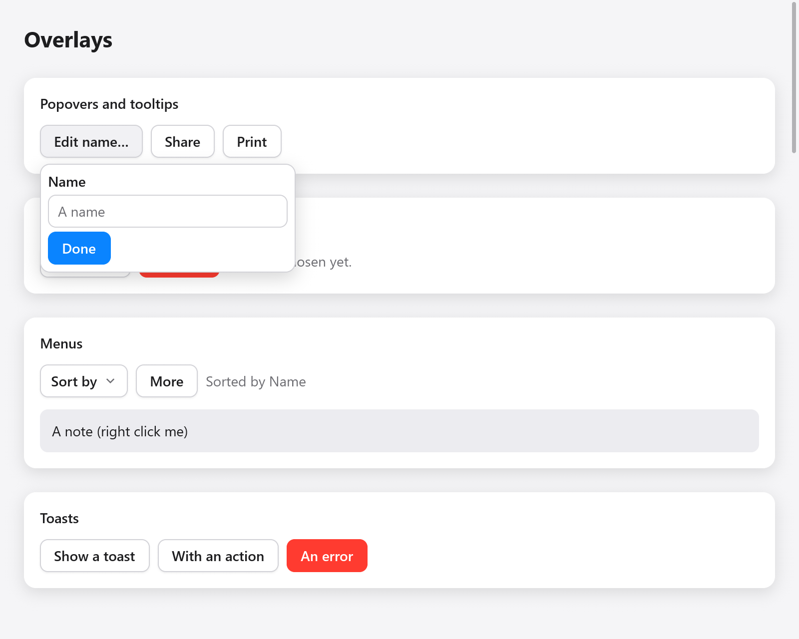
An open popover anchored to the Edit name button.
const State = struct {
    pop: ui.OverlayState = .{},
    rename: ui.OverlayState = .{},
    alert: ui.OverlayState = .{},
    toasts: ui.Toasts = .{},
    name: ui.TextBuffer = .{},
};
OverlayState has show, close and toggle, and the field open. In the frame the user closed it (Escape, a press outside) its dismissed flag is set: an overlay that must stay open sets open back to true then. As it opens it remembers the keyboard focus, and gives it back as it closes, so Tab goes on from the button that opened it.
Popovers
ui.popover(c, &state, anchor, opts) shows a panel beside the element anchor (any ui.Interaction: a button's, a ui.pressable's) while state.open, and returns null while it is closed. Its children follow, then the panel's end:
const more = ui.button(c, "Edit name…", .{});
if (more.clicked) s.pop.toggle();
if (ui.popover(c, &s.pop, more, .{})) |p| {
    defer p.end();
    ui.text(c, "Name", .{ .weight = .semibold });
    _ = ui.textField(c, &s.name, .{ .placeholder = "A name" });
    if (ui.button(c, "Done", .{ .variant = .primary }).clicked) s.pop.close();
}
A press outside the popover or Escape closes it, and the press goes on to what is under the pointer, as the web's popovers do: a press on another button closes the popover and presses that button, and a press on the anchor closes it as the anchor toggles it. Escape goes first to what is inside the panel (a select's open list, a field's own popover), then to the panel.
ui.PopoverOptions:
| Field | Default | |
|---|---|---|
side | .below | .below, .above, .right or .left of the anchor |
align | .start | .start (lined up with the anchor's start) or .center |
gap | 6 | points between the anchor and the panel |
padding | .all(8) | the panel's padding |
gap_children | 4 | the gap between the panel's children |
width | .auto | the panel's width |
max_width | 360 | |
bare | false | no look of its own: style it with Panel.style() |
Where there is no room on side, the panel goes on the other side; along it, it lines up at the start (or the end, where the start would leave the window) and is then moved inside the window, 4 points from its edges. The panel fades in over its first frames.
A bare popover has no background, border, radius or shadow. Its Panel.style() returns the panel box's *ui.Style, to give it your own:
if (ui.popover(c, &s.pop, more, .{ .bare = true })) |p| {
    defer p.end();
    const st = p.style();
    st.background = c.theme.accent;
    st.radius = 12;
    st.padding = .all(12);
    ui.text(c, "Saved", .{ .color = .white });
}
Tooltips
ui.tooltip(c, anchor, tip) shows tip above the element anchor (below it where there is no room above), centered, once the pointer has rested on it for 0.6 seconds, or at once when it has the keyboard focus or another tip went less than 0.4 seconds ago, so moving along a toolbar shows each tip at once. It goes as the pointer leaves; a press on the element or Escape hides it until the pointer leaves and comes back. The pointer goes through it. The theme's tooltip_delay (seconds) changes the wait: 0 keeps 0.6 seconds, a negative delay shows tips at once, and the warm time follows at two thirds of it. Set it on c.theme around part of the view, as a toolbar, and those elements' tips wait as it says.
const share = ui.button(c, "Share", .{});
ui.tooltip(c, share, "Share with others");
The tip is read to assistive technology after the element's name, shown or not. Its time is the context's clock, so a test advances the Tester's clock rather than waiting (see Testing).
A tip of your own: ui.tooltipBase(c, anchor) opens the tip's box and returns its node index while it shows, null otherwise; add its content, then ui.tooltipEnd(c, anchor), which places it by its element.
const info = ui.button(c, "Shortcuts", .{});
if (ui.tooltipBase(c, info)) |box| {
    c.node(box).style.background = c.theme.surface;
    c.node(box).style.border = c.theme.border;
    ui.text(c, "Open", .{ .weight = .semibold });
    ui.kbd(c, ui.keys.label("⌘O"));
    ui.tooltipEnd(c, info);
}
Dialogs
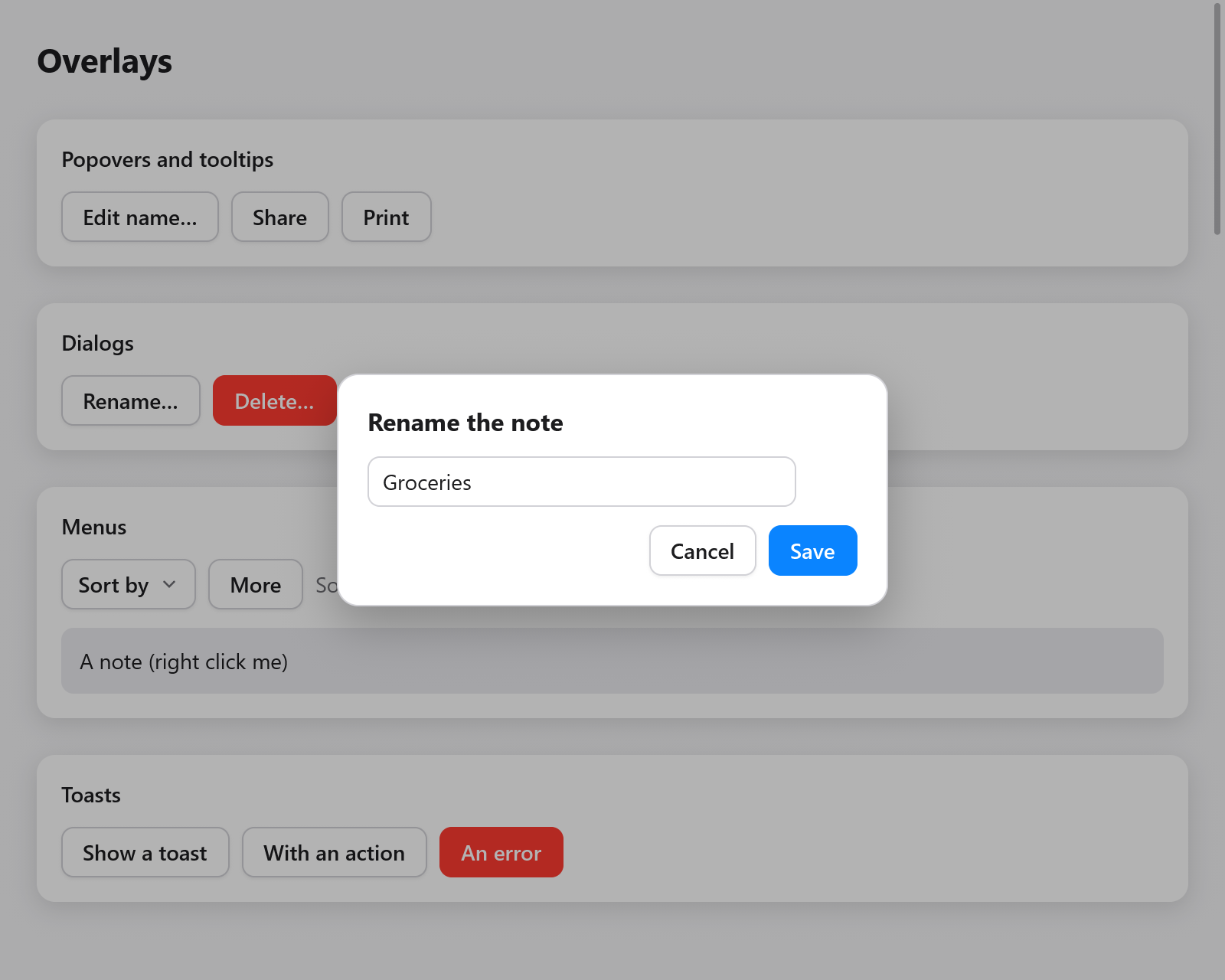
The Rename dialog above a dimmed view.
ui.dialog(c, &state, opts) shows a panel centered over the dimmed window while state.open, and returns a ui.Dialog (null while closed), whose children follow, then end:
if (ui.button(c, "Rename…", .{}).clicked) s.rename.show();
if (ui.dialog(c, &s.rename, .{})) |d| {
    defer d.end();
    ui.text(c, "Rename the note", .{ .weight = .bold, .size = 16 });
    if (ui.textField(c, &s.name, .{ .width = .{ .px = 280 } }).submitted) s.rename.close();
    ui.row(c, .{ .gap = 8, .justify = .end, .width = .fill });
    defer ui.end(c);
    if (ui.button(c, "Cancel", .{}).clicked) s.rename.close();
    if (ui.button(c, "Save", .{ .variant = .primary }).clicked) s.rename.close();
}
A dialog keeps the window to itself: its backdrop takes the pointer, a press on the backdrop closes the dialog unless dismissible is false, and Escape closes it (unless escape is false) once nothing inside took Escape first. The focus behind it is dropped as it opens and given back as it closes.
Tab and Shift+Tab stay among its enabled controls. Set trap_focus to false only when the app supplies its own focus handling.
ui.DialogOptions:
| Field | Default | |
|---|---|---|
width | .{ .px = 360 } | the panel's width |
padding | .all(20) | |
gap | 12 | between the panel's children |
dismissible | true | a press on the backdrop closes it |
escape | true | Escape closes it |
bare | false | no look: style it with Dialog.backdropStyle() and Dialog.panelStyle() |
animated | true | fade in when opening |
trap_focus | true | Tab and Shift+Tab stay in the dialog |
Alert dialogs
ui.alertDialog(c, &state, title, message, buttons) asks about something important, as AppKit's alerts do: a title, a message and a row of buttons, the last of which is the default, drawn in the accent color, which Enter clicks. Escape closes it choosing none; a press outside does nothing. Choosing a button closes it. It answers a ui.AlertResult:
if (ui.button(c, "Delete…", .{ .variant = .danger }).clicked) s.alert.show();
switch (ui.alertDialog(c, &s.alert, "Delete “Groceries”?", "You can't undo this.", &.{ "Cancel", "Delete" })) {
    .none => {},
    .chosen => |i| if (i == 1) s.deleteNote(),
    .dismissed => {},
}
.chosen carries the index of the button clicked (the last one, for Enter); .dismissed means Escape closed it, as canceling does.
For the system's own message boxes, which block until answered and are drawn by the operating system, see myzig.dialog in System.
Toasts
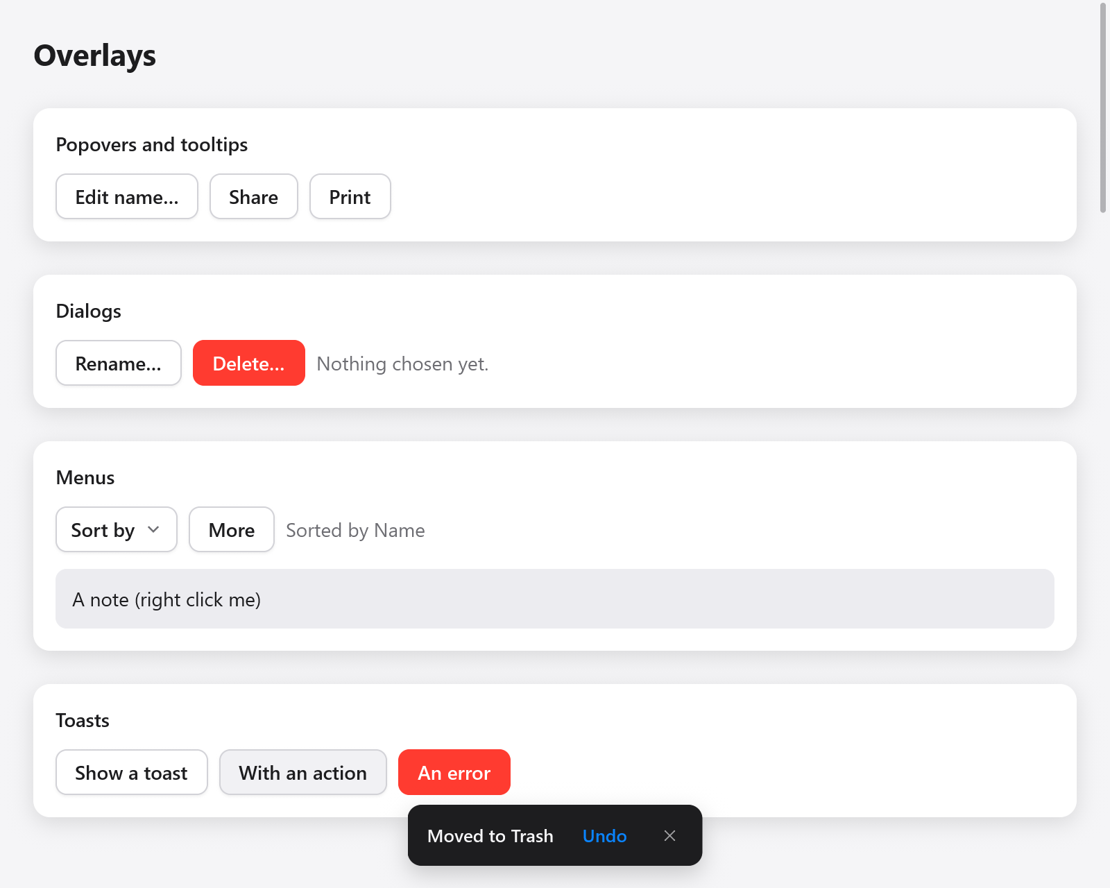
A toast with an Undo action at the bottom of the view.
Toasts are short messages near the bottom of the window, the outcome of what the user just did, which go after a few seconds. The app keeps one ui.Toasts per window and adds to it from anywhere in the view:
if (ui.button(c, "Save", .{}).clicked) _ = s.toasts.show("Saved");
if (ui.button(c, "Delete", .{}).clicked) s.undo = s.toasts.showAction("Moved to Trash", "Undo");
if (ui.button(c, "Connect", .{}).clicked) _ = s.toasts.add(.{ .title = "Couldn't connect", .kind = .@"error" });
and builds them once, last in the view, so that they are over the other overlays:
const r = ui.toasts(c, &s.toasts);
if (r.action) |id| if (id == s.undo) s.restore();ui.Toast, what add takes (its strings are copied, so c.print is fine):
| Field | Default | |
|---|---|---|
title | ||
description | "" | a second line |
kind | .info | .info, .success or .@"error", which sets its icon and color |
timeout | 0 | seconds it shows: 4 when 0 (8 with an action), until closed when negative |
action | "" | a button that closes it, reported by ui.toasts |
key | "" | names it: adding a toast with the key of one showing changes that one, which shows anew (its title when empty) |
add, show and showAction return the toast's id; close(id), closeAll(), has(id) and count() do what they say. ui.toasts returns a ui.ToastResult whose action is the toast whose button was clicked in this frame, and closed the one closed by its close button.
The newest three show, stacked above one another; older ones wait hidden, their time running. Their time is the context's clock (Context.time), not the wall's, and it stops while the pointer rests on them. The pointer goes through the room around them.
Building overlays of your own
Popovers, menus, selects and comboboxes are made of the pieces in ui.overlays (overlay_base.zig), which a widget of your own can use:
overlays.overlay(c, style, seed)opens a box over the window (Context.openOverlay) whose id comes fromseed, so that the boxes built after it keep their ids while it comes and goes: a tip showing must not change the id of the button beside it.overlays.seedOf(&state)makes a seed of the state's address.OverlayState.sync(c)notes the frame it opens in and gives the focus back as it closes; it returns whether it shows.justOpened(c)is true in its first frame,record(c, lo)notes the boxes it built, andpressedOutside(c, anchor_id)says whether this frame's press landed outside them and outside the anchor;dismiss(c)closes it as the user did.overlays.attach(anchor, size, window, side, align, gap)computes where a panel goes, andoverlays.place(c, index, anchor, side, align, gap)measures the overlay box and moves it there, as a panel does as it ends; one that scrolls is first cut to the room on the anchor's larger side (overlays.roomAlong), where it scrolls.overlays.takeKey(c, key)takes a key from this event, so what is built later does not see it: the overlay on top takes Escape first.overlays.fadeIn(c, id, opened)is the opacity of a panel fading in.
See Custom widgets for the boxes, interactions and animated values they are built of.