
Ranges
Controls of a number: sliders and range sliders that set one, steppers and number inputs that step it, and meters, progress bars and spinners that show one (or show that work goes on).
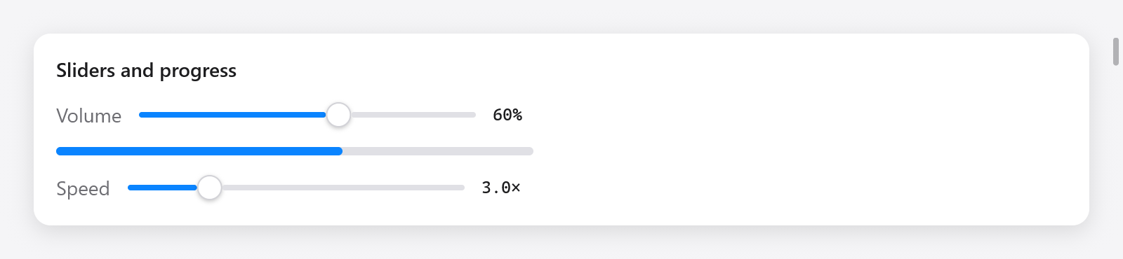
Two sliders with numeric values and a progress bar.
Sliders
ui.slider(c, &value, options) sets an f32 between bounds by dragging its knob or pressing its track. It returns true while it changes the value:
ui.row(c, .{ .gap = 12, .align_items = .center });
defer ui.end(c);
ui.text(c, "Volume", .{ .color = c.theme.muted });
_ = ui.slider(c, &s.volume, .{ .width = .{ .px = 240 }, .label = "Volume" });
ui.textf(c, .{ .mono = true, .size = 12 }, "{d:.0}%", .{s.volume * 100});ui.SliderOptions:
| field | default | what it does |
|---|---|---|
min, max | 0, 1 | the bounds |
width | 200 points | a ui.Length |
label | "" | names it for assistive technology |
The knob takes the keyboard focus; while focused, Left and Right move it by a twentieth of its range. Assistive technology reads it as a slider with its value and bounds, and can step it.
Range sliders
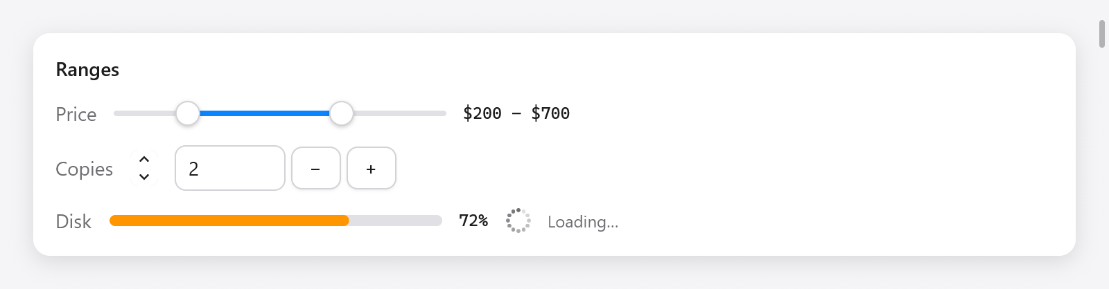
A price range, stepper, number input, meter and loading spinner.
ui.rangeSlider(c, &low, &high, options) sets two f64s with two knobs, as a price range. Each knob takes the keyboard focus, and the arrows, Home and End move it; a press on the track moves the knob nearest to it. The knobs never cross. It returns true when a value changes:
_ = ui.rangeSlider(c, &s.low, &s.high, .{ .min = 0, .max = 1000, .step = 10, .width = 240 });
ui.text(c, c.print("${d:.0} – ${d:.0}", .{ s.low, s.high }), .{ .mono = true, .size = 12 });ui.RangeSliderOptions: min and max (0 and 1), width (200 points, an f32), and step: above 0, values snap to min plus multiples of it, and the track shows tick marks.
Steppers
ui.stepper(c, &value, options) is a pair of arrows changing an f64 by a step, as AppKit's stepper beside a field. A click steps, holding an arrow keeps stepping (faster after a while), and Up, Down, Home and End step with the keyboard focus. It returns true when the value changes:
_ = ui.stepper(c, &s.copies, .{ .min = 1, .max = 20 });ui.StepperOptions: min (0), max (100) and step (1).
Number inputs
ui.numberInput(c, &value, &text, options) is a text field editing an f64 between bounds, with − and + buttons beside it. Up and Down, and the buttons, change it by the step. What is typed applies as soon as it is a number in range, and shows rounded to the step's decimals once the field loses the focus. text is the field's ui.TextBuffer, kept in your state beside the value:
const State = struct {
    copies: f64 = 2,
    copies_text: ui.TextBuffer = .{},
};

_ = ui.stepper(c, &s.copies, .{ .min = 1, .max = 20 });
_ = ui.numberInput(c, &s.copies, &s.copies_text, .{ .min = 1, .max = 20 });
A stepper and a number input over the same value stay in step, as above. ui.NumberInputOptions: min (0), max (100), step (1) and width (80 points, a ui.Length). It returns true when the value changes.
Meters
ui.meter(c, value, options) shows a value between bounds, as AppKit's level indicator and the web's <meter>: in the success color, or the warning (orange) and danger colors from the levels given:
ui.meter(c, s.disk_used, .{ .warning = 0.7, .critical = 0.9, .width = .{ .px = 240 } });
// A battery: low values are the bad ones, since critical is below warning.
ui.meter(c, s.battery, .{ .warning = 0.2, .critical = 0.1 });ui.MeterOptions: min and max (0 and 1), warning and critical (null: none), and width (160 points). A critical below warning makes low values the bad ones.
Progress bars
ui.progress(c, value, width) is a bar filled to value, from 0 to 1, easing toward it as it changes:
ui.progress(c, s.downloaded, .{ .px = 340 });
ui.progress(c, s.done, .fill);
Assistive technology reads it as a progress indicator with its value. For a window's progress on its taskbar button (Windows, and Linux launchers that show it), see Window.setProgress.
Spinners
ui.spinner(c, options) shows work of unknown length, as AppKit's spinning indicator: dots round a circle, fading behind the one leading, stepping a twelfth of a turn every twelfth of 0.9 seconds on the context's clock:
ui.row(c, .{ .gap = 8, .align_items = .center });
defer ui.end(c);
ui.spinner(c, .{});
ui.text(c, "Loading…", .{ .size = 12, .color = c.theme.muted });ui.SpinnerOptions: size (18 points) and color (the muted text color by default). A spinner asks for a frame only at each step (c.frameIn), not at every refresh, so a window showing one stays nearly idle. In tests, advance the Tester's clock to step it.