
Dates, times and colors
Calendars, fields of dates and times of day, and color pickers. Each edits a value of your state through a pointer and returns true when the user changed it.
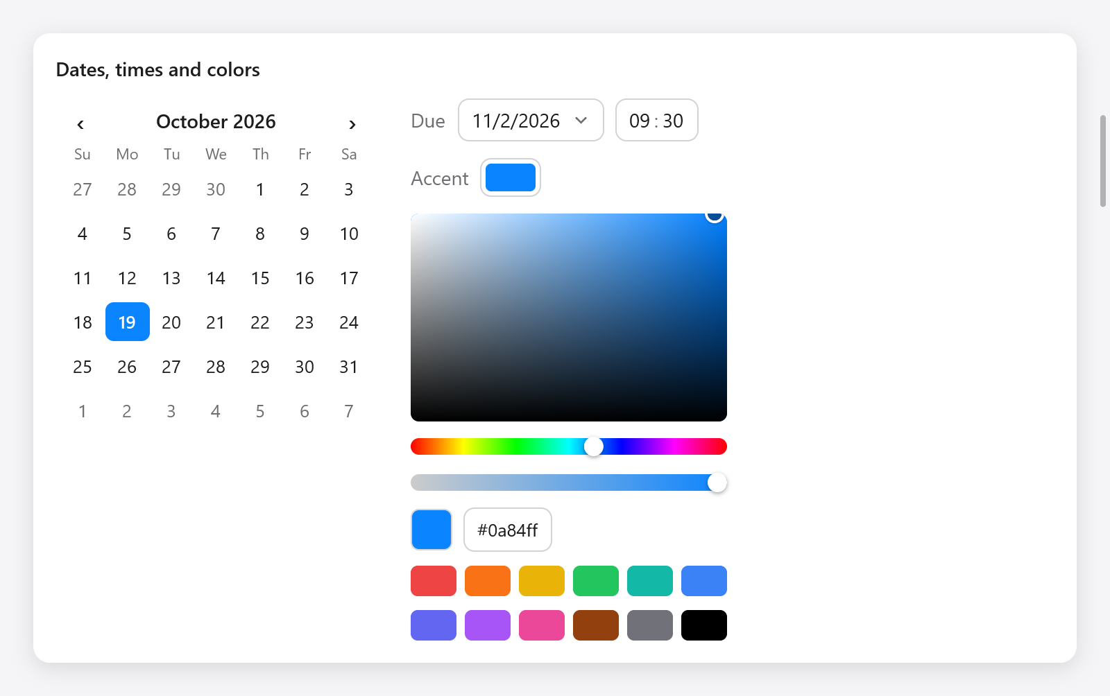
Calendar, date and time inputs, color well and color picker.
Dates
ui.Date is a day of the proleptic Gregorian calendar: year (an i32), month (1 to 12) and day (1 to the month's last). It has no time zone and no time of day.
| method | what it does |
|---|---|
toDays(), fromDays(n) | days since 1970-01-01, and back |
addDays(n) | n days later (earlier if negative) |
addMonths(n) | n months later, on the same day or the month's last: January 31 and a month is February's last day |
weekday() | 0 for Sunday to 6 for Saturday |
eql(b) | the same day |
valid() | the month and the day within their bounds |
const due: ui.Date = .{ .year = 2026, .month = 11, .day = 2 };
const week_later = due.addDays(7);
const days_left = due.toDays() - today.toDays();
The widgets do not read the clock: the app passes today where it is wanted. To show dates as the user's language writes them, see i18n.
Calendars
ui.calendar(c, &date, options) shows a month and chooses a day, as SwiftUI's graphical date picker. A click chooses a day, as the arrows do while it has the keyboard focus; Page Up and Page Down, or its buttons, move by months; Home and End go to the first and the last day of the month. It returns true when the date changes:
_ = ui.calendar(c, &s.day, .{ .today = s.today, .first_weekday = 1 });ui.CalendarOptions:
| field | default | what it does |
|---|---|---|
first_weekday | 0 | the first day of the week: 0 for Sunday (the United States), 1 for Monday (most of Europe) |
today | null | today, marked with a ring; none when null |
Date inputs
ui.dateInput(c, &date, options) is a field showing the date in numbers, which a calendar below it changes. A click, Enter or Space opens the calendar, where a click chooses a day, as the arrows and Enter do; Page Up and Page Down, or its buttons, move by months; Escape or a click outside closes it. It returns true when the date changes:
ui.row(c, .{ .gap = 8, .align_items = .center });
defer ui.end(c);
ui.text(c, "Due", .{ .color = c.theme.muted });
_ = ui.dateInput(c, &s.due, .{ .format = .day_month_year, .calendar = .{ .first_weekday = 1 } });ui.DateInputOptions: format, a ui.DateFormat, and calendar, the options of its calendar.
ui.DateFormat | shows January 5, 2026 as |
|---|---|
.month_day_year (default) | 1/5/2026, as in the United States |
.day_month_year | 05/01/2026, as in the United Kingdom |
.year_month_day | 2026/1/5, as in China |
Times of day
ui.Time is a time of day: hour (0 to 23) and minute (0 to 59).
ui.timeInput(c, &time, options) edits one in segments. Up and Down step the segment with the focus round the clock; digits typed set it, going on to the minutes once the hours are typed; A or P choose the half of the day; Left and Right move between the segments; a click focuses one. It returns true when the time changes:
_ = ui.timeInput(c, &s.alarm, .{});
_ = ui.timeInput(c, &s.meeting, .{ .twelve_hour = true });ui.TimeInputOptions: twelve_hour (3:04 PM rather than 15:04), and am and pm, the words of the two halves of the day ("AM" and "PM"), for other languages.
Color pickers
ui.colorPicker(c, &color, &picker) edits a ui.Color, as AppKit's color panel: a square choosing the saturation (across) and the brightness (up) of the hue the slider below it chooses; a slider of opacity; the color in hex, which the user edits; and swatches. The arrows move across the square while it has the keyboard focus. It returns true when the color changes:
const State = struct {
    tint: ui.Color = .hex(0x0a84ff),
    picker: ui.ColorPicker = .{},
};

if (ui.colorPicker(c, &s.tint, &s.picker)) s.recolor();
ui.ColorPicker is what a picker keeps across frames, in your state: the hue a gray keeps (so dragging to white and back keeps the hue), the hex being typed, and whether a well's picker is open. When the app changes the color itself, the picker starts from it.
ui.parseHex(s) reads #rgb, #rrggbb or #rrggbbaa (the # optional) into a color, or null, for colors kept in settings as text.
Color wells
ui.colorWell(c, &color, &picker) is a swatch of the color that opens a picker below it, as AppKit's color well: a click, Enter or Space opens it, and Escape or a click outside closes it. It returns true when the color changes:
ui.row(c, .{ .gap = 8, .align_items = .center });
defer ui.end(c);
ui.text(c, "Accent", .{ .color = c.theme.muted });
_ = ui.colorWell(c, &s.tint, &s.well);
Give each well a ui.ColorPicker of its own.
To make the chosen color the app's accent, see ui.preferences.setAccent or ui.themes.withAccent.