
Choices
Controls that choose: checkboxes and switches for one setting, checkbox groups for several, radio buttons and segmented controls for one of a few, and ratings. Each edits a value of your state through a pointer and returns true when the user changed it, so you can act on the change.
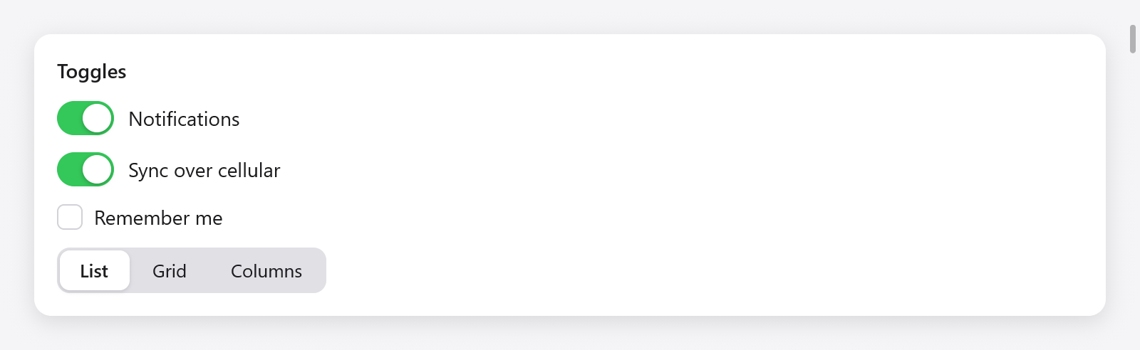
Switches, a checkbox and a segmented control in the Gallery.
Checkboxes
ui.checkbox(c, title, &value) draws a box and its label and flips the bool on a click (or Enter or Space while focused):
_ = ui.checkbox(c, "Remember me", &s.remember);
if (ui.checkbox(c, "Show hidden files", &s.hidden)) s.reload();
The check eases in and out. The label is part of the control: a click on it toggles too. A checkbox with an empty title is the box alone, for a table's column of checks.
Checkbox groups
ui.checkboxGroup(c, title, values, labels) draws a checkbox over a group of checkboxes, one for each of values (a []bool) named by labels, indented below it, as a list of permissions. The group's box is checked when they all are and mixed (a dash) when some are; a click on it, or Space while it has the focus, checks them all, or none when they all are. It returns true when any changed:
const State = struct {
    notify: [3]bool = .{ true, false, true },
};

_ = ui.checkboxGroup(c, "Notifications", &s.notify, &.{ "Mail", "Calendar", "Reminders" });
Assistive technology reads the group's box as a checkbox that is on, off or mixed.
Switches
ui.toggle(c, title, &value) is a switch, as on iOS and in macOS's settings, for a setting that applies at once:
_ = ui.toggle(c, "Notifications", &s.notifications);
if (ui.toggle(c, "Dark", &s.dark)) s.theme.switchTo(if (s.dark) ui.Theme.dark_theme else ui.Theme.light);
Its knob slides and its track fills with the success color as it turns on. In a form, give it an empty title and let the field label it.
Radio buttons
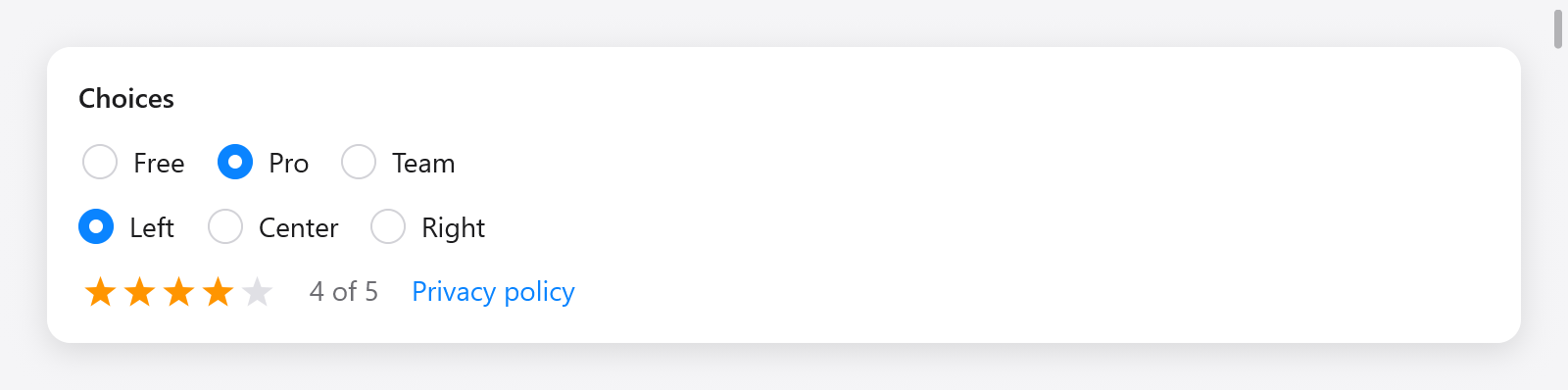
Radio groups and a four-star rating.
ui.radio(c, &selected, value, title) is one radio button: it is on while selected.* equals value (compared with std.meta.eql, so any type works: an integer, an enum, a struct), and a click sets it. It returns true when a click selects it:
ui.row(c, .{ .gap = 16, .align_items = .center });
defer ui.end(c);
_ = ui.radio(c, &s.alignment, 0, "Left");
_ = ui.radio(c, &s.alignment, 1, "Center");
_ = ui.radio(c, &s.alignment, 2, "Right");
Clicking the one already selected changes nothing and returns false.
Radio groups
ui.radioGroup(c, &selected, choices, options) draws a radio button for each of choices ([]const ui.Choice(T): a label and a value) as one control taking the keyboard focus: the arrows choose among them, and Home and End the first and the last. It returns true when the choice changes:
const Plan = enum { free, pro, team };

_ = ui.radioGroup(c, &s.plan, &.{
    .{ .label = "Free", .value = .free },
    .{ .label = "Pro", .value = .pro },
    .{ .label = "Team", .value = .team },
}, .{ .row = true, .gap = 16 });ui.RadioGroupOptions: row (a row rather than a column) and gap (8). Assistive technology reads the group as a radio group, and each button's place in it.
Segmented controls
ui.segmented(c, options, &selected) chooses one of a few labels, as AppKit's segmented control: options is a slice of strings and selected a usize index. It returns true when the choice changes:
_ = ui.segmented(c, &.{ "List", "Grid", "Columns" }, &s.view_mode);
switch (s.view_mode) {
    0 => s.listView(c),
    1 => s.gridView(c),
    else => s.columnView(c),
}
The chosen segment lifts onto the surface color with a shadow, easing between segments.
Ratings
ui.rating(c, &value, options) is a row of stars, value (a u8) of them filled. A click on a star sets the rating, a click on the star already set clears it, and the arrows, Home and End change it with the keyboard focus. While the pointer rests on the stars, they show what a click would set. It returns true when the rating changes:
_ = ui.rating(c, &s.stars, .{});
ui.text(c, c.print("{d} of 5", .{s.stars}), .{ .color = c.theme.muted });ui.RatingOptions: max (5 stars) and size (18 points).
Toggling from the keyboard
Every control here takes the keyboard focus with Tab and draws the focus ring when focused from the keyboard. Checkboxes and switches toggle on Enter and Space; radio groups and ratings move with the arrows. Tests drive them the same way:
try t.clickText("Large"); // selects the radio button labeled "Large"
t.key(.right);            // the next choice of a focused radio group
See testing.