
Lists, trees, tables and grid views
Collections of items: the virtualized list, trees, outlines, tables and grid views. All but the tree build only the rows in view (and a few around them), so a list of a hundred thousand rows costs what a screenful does. The choice they make is the app's, kept in its state; their end returns what happened in this frame.
| Widget | For | Builds |
|---|---|---|
ui.list | rows of one height | the rows in view |
ui.tree | a small tree, each item inside its parent | every item shown |
ui.outline | a tree of any size, as Finder's list view | the rows in view |
ui.table | rows in sortable columns under a header | the rows in view |
ui.gridView | items in a wrapping grid, as Photos' library | the rows in view |
For a layout of cells in rows and columns that holds every child (a form, a dashboard), use ui.grid instead.
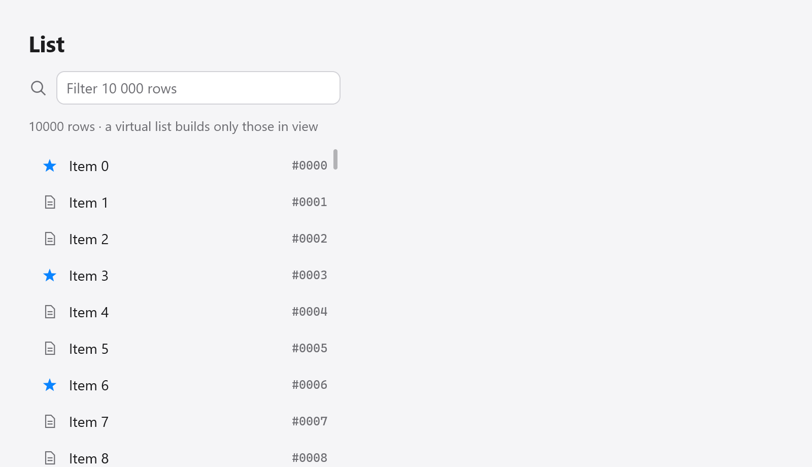
A virtual list of 10,000 rows; only the visible rows are built.
Lists
ui.list(c, opts) is a virtualized list, in the manner of GPUI's uniform_list: rows of one height, of which only those in view are built. It scrolls; next() gives the index of each row to build, then end() closes it:
var rows = ui.list(c, .{ .count = s.items.len, .row_height = 36 });
while (rows.next()) |i| {
    const row = ui.div(c).row().wFull().h(36).px(12).gap(10).itemsCenter().rounded(6).hover(c.theme.surface_hover);
    defer row.end();
    ui.icon(c, "doc.text", .{ .size = 13, .color = c.theme.muted });
    ui.text(c, s.items[i].name, .{});
}
rows.end();
Each row must be row_height tall: build it with that height. The list gives each row an id from its index, so a row keeps its hover and animations as the list scrolls; when rows are filtered or reordered and their state must follow the item, key the row's content with ui.key (see Views).
ui.ListOptions:
| Field | Default | |
|---|---|---|
count | how many rows | |
row_height | each row's height, in points | |
width, height | .fill | the list's box |
gap | 0 | between rows |
padding | none | |
overscan | 4 | rows built beyond each edge of the view, for smooth scrolling |
scroll_to | null | scrolls the list to this offset, in points, in this frame |
follow_end, follow_glide | false, null | starts at the end and keeps it in view as rows come, gliding there (layout) |
choice | null | the rows are chosen (below) |
To show row i, scroll to i * (row_height + gap). The rows' room above and below the view is kept by empty boxes, so the scroll bar is that of the whole list.
Choosing rows
With choice, a *ui.ListChoice the app keeps, the list opens each row's box itself (row_height tall; build the row's content in it) and its rows are chosen: a click chooses a row, the arrows, Home, End and Page Up and Down move choice.selected while the list has the focus, and Enter or a double click submits it. rows.result, read after end(), has changed, submitted, focused and menu_row, the row right-clicked in the frame; rows.textColor() is the color of text on the row being built.
With choice.selection, a *ui.Selection (a set of the rows' keys), the user chooses several, as in Finder: Shift-clicks and Shift with the arrows extend the choice from the row it began on, Cmd-clicks (Ctrl-clicks off the Mac) add a row or take it out, and Cmd+A chooses every row. A press on a row not chosen chooses it as the pointer goes down; one on a chosen row waits for the release. A right-click on a row not chosen chooses it before its context menu opens, so the menu acts on the row it was opened on; on a chosen row the choice stays. choice.menu_keeps_selection leaves the choice as it is (the menu acts on menu_row alone). A list without a selection never chooses on a right-click.
choice.key (ui.SelectionKey.of(ctx, keyOf)) gives each row's item an identity: the selection holds the items' keys, and the cursor follows its item as rows come, go and move, while the selection still holds it, so the app choosing another row at the cursor's index (a file pasted, sorted there; an item renamed in its place) keeps the app's choice.
s.choice = .{ .selection = &s.chosen, .key = .of(s, State.keyOf) };
var rows = ui.list(c, .{ .count = s.files.len, .row_height = 28, .choice = &s.choice });
while (rows.next()) |i| {
    const name = c.leaf(.{ .padding = .xy(8, 0) }, .{ .text = .{ .str = s.files[i].name, .style = .{}, .color = rows.textColor() } }, null);
    if (ui.rowDoubleClicked(c, name)) s.rename(i);
}
rows.end();
ui.rowDoubleClicked(c, index) tells that a row's double click landed on the element index, without taking the click from the row, which goes on choosing (a table's cells read it too).
Trees
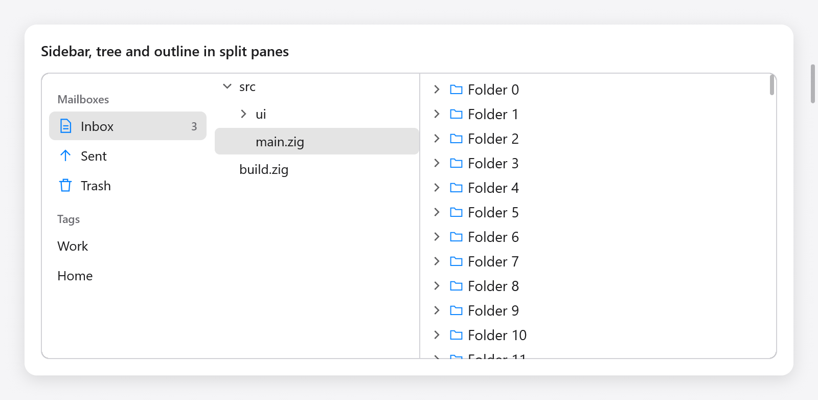
A file tree beside an outline of folders.
ui.tree(c, &chosen, opts) is a tree whose items are built inside the item they belong to, their children showing while it is open. Items are named by keys the app keeps (paths, ids); chosen.* is the key of the item chosen.
var tr = ui.tree(c, &s.chosen, .{});
if (tr.item("src", "src", &s.src_open)) {
    defer tr.endChildren();
    if (tr.item("src/ui", "ui", &s.ui_open)) {
        defer tr.endChildren();
        _ = tr.item("src/ui/list.zig", "list.zig", null);
        _ = tr.item("src/ui/tree.zig", "tree.zig", null);
    }
    _ = tr.item("src/main.zig", "main.zig", null);
}
_ = tr.item("build.zig", "build.zig", null);
if (tr.end().submitted) s.open(s.chosen);
item(key, label, open) adds an item; a null open makes a leaf. It returns true while the item's children show: build them, then endChildren().
A click on an item's arrow opens or closes it; a click elsewhere on it chooses it. While the tree has the keyboard focus, Up and Down choose the items around, Right opens the item or goes to its first child, Left closes it or goes to its parent, and Enter (or a double click) submits the choice. ui.TreeOptions has width (.fill), height (.auto), row_height (26) and indent (16, what each level adds before an item's arrow). The result has changed, submitted and focused.
A tree builds every item it shows. For thousands of items, use an outline.
Outlines
ui.outline(T, c, &state, roots, provider, opts) shows a tree of items of type T as AppKit's outline view and Finder's list view do: below each open item its children, indented, with an arrow that opens and closes it. It builds only the rows in view.
The app keeps a ui.OutlineState(T), the items open and the one chosen (selected). provider.children(item) returns an item's children, empty for one without any; provider is any value with that method, usually the app's state:
const Files = struct {
    folders: ui.OutlineState(u32) = .{},
    roots: []const u32 = &.{ 0, 1, 2, 3 },
    kids: [20]u32 = undefined,

    pub fn children(s: *Files, item: u32) []const u32 {
        if (item >= 1_000_000) return &.{};
        for (&s.kids, 0..) |*v, f| v.* = 1_000_000 + item * 100 + @as(u32, @intCast(f));
        return &s.kids;
    }

    fn view(s: *Files, c: *ui.Context) void {
        var rows = ui.outline(u32, c, &s.folders, s.roots, s, .{ .row_height = 24 });
        while (rows.next()) |r| {
            const folder = r.item < 1_000_000;
            ui.icon(c, if (folder) "folder" else "doc", .{ .size = 12, .color = c.theme.muted });
            ui.text(c, if (folder) c.print("Folder {d}", .{r.item}) else "A file", .{});
        }
        if (rows.end().submitted) s.openItem(s.folders.selected.?);
    }
};
next() opens each row in view, its indent and arrow already added, and returns a ui.OutlineRow(T): the item, its depth, has_children and its parent row. Add the row's content; the next next() closes it.
Items are compared by value, and strings ([]const u8) by their bytes, so paths work as items. The state's isOpen(item), setOpen(gpa, item, open) and isSelected(item) open folders from code (to reveal a file); free it with deinit(gpa).
While the outline has the focus, Up, Down, Home, End and Page Up and Down choose rows, Right opens the item chosen or goes to its first child, Left closes it or goes to its parent, and Enter (or a double click) submits it. Closing an item whose child was chosen chooses the item. Rows keep their identity (their hover) as items open and close above them. ui.OutlineOptions has row_height (26), indent (16), width and height (.fill) and padding (.all(4)).
Tables
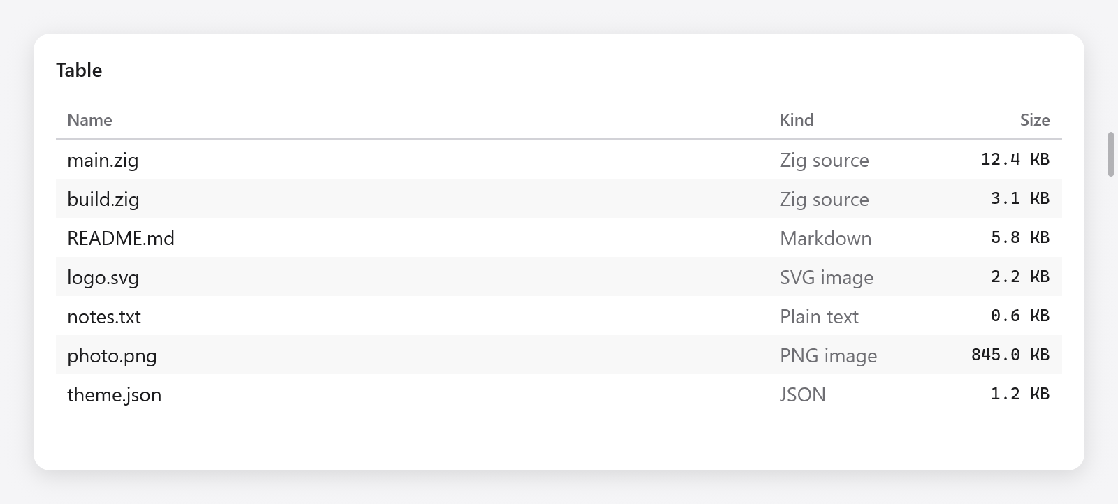
A file table with sortable Name, Kind and Size columns.
ui.table(c, &state, columns, count, opts) shows count rows in columns under a header, built as they show. next() opens each row in view, cell() each of its columns, then end():
const columns: []const ui.TableColumn = &.{
    .{ .title = "Name", .sortable = true },
    .{ .title = "Kind", .width = 120, .sortable = true },
    .{ .title = "Size", .width = 90, .alignment = .end, .sortable = true },
};

var tb = ui.table(c, &s.table, columns, files.len, .{});
while (tb.next()) |row| {
    const f = files[s.order[row]];
    while (tb.cell()) |col| switch (col) {
        0 => ui.text(c, f.name, .{ .color = tb.textColor() }),
        1 => ui.text(c, f.kind, .{ .color = c.theme.muted }),
        else => ui.text(c, c.print("{d} KB", .{f.size / 1000}), .{ .mono = true, .size = 12 }),
    };
}
if (tb.end().sorted) s.sortFiles(); // by s.table.sort
A ui.TableColumn has a title, a width in points (0 shares the room the other columns leave), an alignment (.start, .center or .end) and sortable.
The app keeps a ui.TableState: selected, the row chosen, and sort, a ui.TableSort (column, descending) or null. A click on a sortable column's header sorts by it, ascending, and a second click reverses the order: the header shows an arrow, end() reports sorted, and the app sorts its rows as state.sort says. The table never reorders the app's data itself: row is a place in the order the app keeps.
A click chooses a row; while the table has the focus, the arrows, Home, End and Page Up and Down do, and Enter (or a double click) submits it. textColor() is the color of text on the row being built: the accent's text on the row chosen while the table has the focus.
ui.TableOptions has row_height (28), header_height (28), width and height (.fill), striped (every other row tinted, true), drag_select, cells and cell_menu (below). The result has changed, sorted, submitted, focused, drag_selecting and menu_row and menu_col, the row and the column right-clicked in the frame.
Choosing rows and cells
With drag_select, a drag over the rows chooses those it goes over from the row it pressed, scrolling the table as the pointer nears or passes its top or bottom, and a Shift-click or Shift with the arrows extends the choice: the rows chosen are those from state.anchor to state.selected (state.rows(), state.rowChosen(i)). A press on a row not chosen chooses it as the pointer goes down, as a spreadsheet does; one on a chosen row waits for the release, so a drag of the choice keeps it. drag_selecting reports a drag under way, for work that follows the choice (a sum of what is chosen) to wait until it ends.
With cells, the table chooses a block of cells: the rows chosen times the columns from state.cols[0] to state.cols[1], in the order shown. A click chooses a cell, a Shift-click extends the rows and the columns to it, and a drag chooses the cells it goes over. Left and Right move the cursor's column, Shift with them extends the columns, the keys that move the rows leave one column unless with Shift, and Cmd+A (Ctrl+A) chooses every row and column. The block's cells show in the accent color while the table has the focus; chosen rows are not tinted whole. t.cellSelected(row, col) tells a cell builder whether its cell is chosen, and textColor() is the accent's text in it:
var tb = ui.table(c, &s.sheet, columns, rows.len, .{ .cells = true });
while (tb.next()) |row| {
    while (tb.cell()) |col| ui.text(c, rows[row][col], .{ .color = tb.textColor() });
}
_ = tb.end();
With state.selection (a *ui.Selection, and state.key as a list's), the rows chosen are a set: Cmd-clicks add rows and take them out (and keep the columns), Shift extends from the row the last click was on, and Cmd+A chooses every row. A right-click on a row, or with cells on a cell, outside the choice chooses it before its menu opens; inside, the choice stays; state.menu_keeps_selection leaves it as it is.
A row_header column, as a spreadsheet's row numbers, chooses whole rows with cells: a click or a drag on its cells chooses rows with every column, and a click on its header every row. It does not sort.
cell_menu (a ui.TableCellMenu: ctx and build(ctx, menu, row, col)) gives the cells a context menu over the whole cell, padding included, built as a context menu's is. A menu built without items does not open, and a context menu of what a cell holds takes the right-click over it instead.
const cols: []const ui.TableColumn = &.{ .{ .title = "#", .width = 48, .row_header = true }, .{ .title = "Name" } };
var tb = ui.table(c, &s.grid, cols, rows.len, .{ .cells = true, .cell_menu = .{ .ctx = s, .build = State.cellMenu } });
Revealing a row
TableState.reveal names a row the app wants shown: in the next frame the table scrolls it into view (as little as it takes) and clears the field. A row the app just added past the end, or one chosen from elsewhere (a search), is shown this way: s.table.reveal = s.rows.items.len - 1;.
Grid views
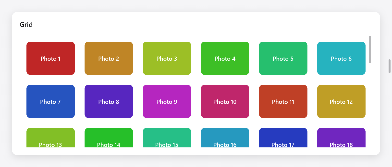
A virtual grid of selectable photo tiles.
ui.gridView(c, &state, opts) shows items in a wrapping grid, as Photos' library and Finder's icon view: as many columns as fit items at least min_item_width wide, sharing the width left, in rows row_height tall. next() opens each item in view, its cell ready for its content:
var g = ui.gridView(c, &s.grid, .{ .count = s.photos.len, .min_item_width = 96, .row_height = 80 });
while (g.next()) |i| {
    ui.column(c, .{ .width = .fill, .height = .fill, .radius = 8, .align_items = .center, .justify = .center, .background = c.theme.surface });
    ui.text(c, s.photos[i].name, .{ .size = 12 });
    ui.end(c);
}
if (g.end().submitted) s.openPhoto(s.grid.selected.?);
The app keeps a ui.GridState, whose selected is the item chosen. A click chooses an item; while the grid has the focus, the arrows move the choice in both directions, Home and End to the ends, Page Up and Down a screenful, and Enter (or a double click) submits it.
ui.GridViewOptions:
| Field | Default | |
|---|---|---|
count | how many items | |
min_item_width | 120 | |
row_height | 120 | |
gap | 8 | between items, both ways |
padding | .all(8) | |
width, height | .fill |
Dragging items
Rows and items become draggable with drag and drop: build the row's content inside a DragDrop.draggable box, and give the list a target.