
Text input
ui.textField edits one line of text kept in your state, in a ui.TextBuffer. Around it are fields built on it: a search field, a token field of chips, a combobox and an autocomplete. For several lines, see the text area; for code, the code editor.
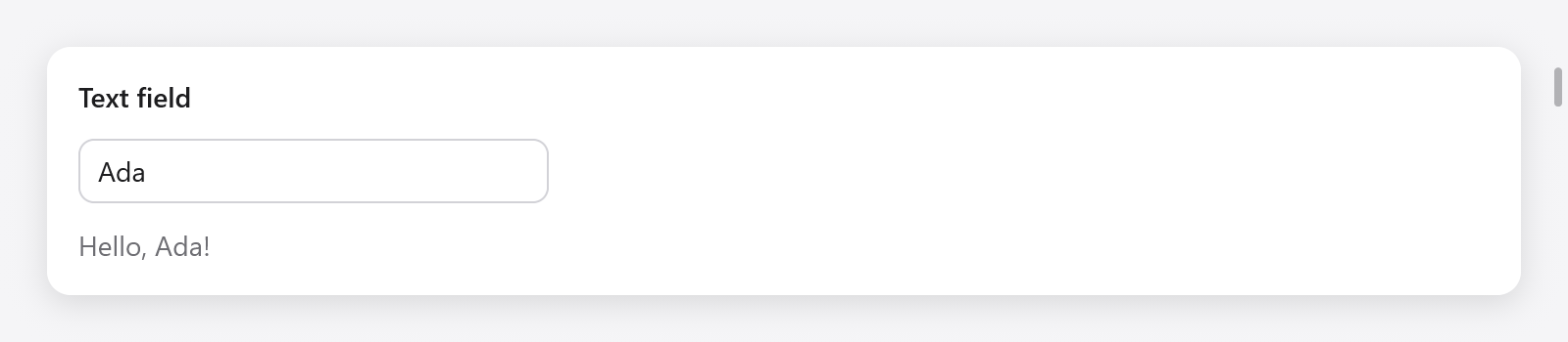
The text field contains Ada; the view immediately shows the greeting.
Text fields
const State = struct {
    name: ui.TextBuffer = .{},
};

fn view(s: *State, c: *ui.Context) void {
    // ...
    const r = ui.textField(c, &s.name, .{ .placeholder = "Your name" });
    if (r.submitted) s.greet();
    const name = s.name.text();
    ui.text(c, if (name.len == 0) "Type to be greeted." else c.print("Hello, {s}!", .{name}), .{});
}
A field takes the keyboard focus when clicked (or with Tab), shows a caret and a selection, scrolls sideways to keep the caret in view, and eases a ring of the accent color around it while focused. It edits through the platform's text input: typing, accents and input methods, the system's key bindings, selection with the keyboard and the mouse (a drag selects, a double click a word), and the clipboard.
TextBuffer.set(text) replaces the text and puts the caret at its end; TextBuffer.select(anchor, caret) selects bytes in the next frame, as a box renaming a file chooses its name without its extension.
ui.TextFieldOptions:
| field | default | what it does |
|---|---|---|
placeholder | "" | faint text shown while it is empty |
width | 240 points | a ui.Length; .fill across its parent |
size | 14 | the text's size |
disabled | false | dim the field, prevent editing and remove it from Tab navigation |
password | false | bullets instead of the text, and the text kept off the clipboard |
suggestion | "" | text drawn faintly after what is typed, as a shell's autosuggestion; → or End at the end of the text takes it |
bare | false | no box of its own (border, fill, focus ring), for a field inside a larger frame, as a chat composer |
caret_width | 1.5 | the caret's width in points, at least a device pixel; 0 hides it, the field staying editable (text areas take it too) |
label | "" | names it for assistive technology (a form's field names its own) |
It returns a result:
| field | true when |
|---|---|
changed | the text changed in this frame |
submitted | Return was pressed |
focused | it has the keyboard focus |
accepted | the suggestion was taken into the text |
caret | (a usize) the caret's byte offset after this frame's edits |
The buffer
Use Input Group to share a frame with icons, affixes and action buttons.
ui.TextBuffer holds up to 1024 bytes of UTF-8, inline, with no allocation: keep it in your state.
| method | what it does |
|---|---|
text() | the text, a slice of the buffer |
set(s) | replaces the text; the caret goes to its end |
clear() | empties it |
insert(at, s) | inserts at byte at; returns how many bytes went in |
remove(from, to) | removes bytes [from, to) |
replace(from, to, s) | replaces bytes [from, to) with as much of s as fits, never cutting a UTF-8 sequence |
Setting want_caret places the caret in the next frame, after the app changed the text. Copy the text out (dupe) to keep it after the buffer changes.
if (r.submitted or ui.button(c, "Add", .{ .variant = .primary }).clicked) {
    s.add(std.mem.trim(u8, s.task.text(), " "));
    s.task.clear();
}
Editing
The keys a field understands come from the platform: on macOS, AppKit's key bindings through the text input system (so a user's own bindings work too); elsewhere, the usual keys of Linux and Windows. Each becomes a ui.TextCommand applied to the focused text:
- moving the caret by characters, words and to the line's ends, and extending the selection the same ways with Shift (
move_word_left,select_line_end, ...); - deleting backward and forward, by characters and words, and to the line's start;
- selecting all, copying, cutting and pasting;
- Up, Down, Page Up, Page Down and the document's ends, which in a one-line field go to an end of the text.
Pasted newlines become spaces in a one-line field. On macOS the Edit menu's Cut, Copy, Paste and Select All reach the focused field too.
Input methods
On macOS, a native view is an NSTextInputClient (src/ui/textinput.zig): accents (holding a key), the Character Viewer, dictation and the input methods of Chinese, Japanese and Korean work in every field, the text being composed shown underlined, with the candidate window under the caret. On Linux, GTK's input method context gives the field the text it commits. On Windows, typed characters (and what an IME commits) come as characters. In browsers, a hidden text area takes the composition, which shows underlined.
Search fields
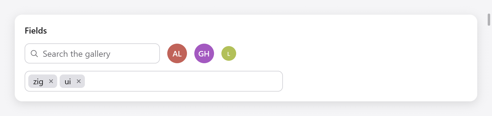
A search field, avatars and a token field containing zig and ui.
ui.searchField(c, &query, options) is a field for searching: a magnifying glass, the text, and a button clearing it while it holds any, as Escape does then:
const r = ui.searchField(c, &s.query, .{ .placeholder = "Search the gallery" });
if (r.changed) s.filter();
if (r.cleared) s.showAll();ui.SearchFieldOptions: placeholder ("Search"), width (220 points) and size (14). The result (ui.SearchResult) has changed, submitted, cleared (the clear button or Escape emptied it) and focused.
Token fields
ui.tokenField(c, &tokens, suggestions, options) edits a set of tokens, as tags or a mail's recipients: chips, each with a button taking it out, wrapping onto more lines, before a text field where Enter or a comma adds what was typed and Backspace while empty takes out the last. The suggestions containing what was typed (ignoring case, and not already tokens) show below it: Up and Down move among them, and Enter or a click adds one. It returns true when the tokens change:
const tags = [_][]const u8{ "design", "docs", "bug", "feature", "performance", "ui", "zig" };

const State = struct {
    tokens: ui.Tokens = .{},
};

_ = ui.tokenField(c, &s.tokens, &tags, .{ .placeholder = "Add a tag", .width = 420 });
ui.Tokens holds up to 64 tokens of 2 KB in all, inline, and the text being typed (query). get(i), count, contains(s), append(s) (trims; false if empty, already there, or too long for what is left) and remove(i) read and change it from the app. ui.TokenFieldOptions: placeholder, width (300 points) and max_suggestions (8).
Comboboxes

A select, font combobox and city autocomplete field.
ui.combobox(c, &selected, options, &state, field_options) chooses one of options (strings) into selected (a ?usize). It shows the choice; a click or Down shows all the options (the click selects the text, so typing replaces it), typing filters them, and the text goes back to the choice as the field loses the focus:
const fonts = [_][]const u8{ "Avenir", "Futura", "Georgia", "Helvetica", "Menlo", "Palatino" };

const State = struct {
    font: ?usize = 3,
    font_box: ui.ComboboxState = .{},
};

const r = ui.combobox(c, &s.font, &fonts, &s.font_box, .{ .placeholder = "Font", .width = .{ .px = 180 } });
if (r.changed) s.applyFont();
ui.ComboboxState keeps its list and the text typed; keep it in your state, one per combobox. The result has changed (a new option was chosen), open and focused. In the open list, the arrows move, Enter chooses and Escape closes the list (not the field's focus).
Autocomplete
ui.autocomplete(c, &buffer, suggestions, &state, field_options) is a text field whose text is the app's (a ui.TextBuffer), suggesting below it those of suggestions that contain what was typed. Up and Down move among them, Enter or a click takes one, and Enter on none submits:
const cities = [_][]const u8{ "Amsterdam", "Berlin", "Lisbon", "London", "Madrid", "Paris" };

const r = ui.autocomplete(c, &s.city, &cities, &s.city_box, .{ .placeholder = "City" });
if (r.submitted) s.search(s.city.text());
ui.AutocompleteState keeps the list. The result has changed (typed or a suggestion taken), submitted, open and focused. ui.ComboFieldOptions, shared by both: placeholder, width (240 points, a ui.Length) and size (14).
A menu of fixed choices with no typing is a select; see menus.
Text that a widget takes itself
A widget of your own that edits text reads the event's operations rather than its keys: c.input.ops is a slice of ui.TextOp, each one of
.insert: text typed or pasted;.set_marked: an input method's composition, with the selection inside it, to be shown underlined until it is committed or.unmarked;.command: aui.TextCommand(.delete_backward,.move_word_left,.select_all,.copy,.insert_newline,.cancel, ...).
Set c.focused_text each frame to the text, its selection and where the caret is drawn, so the input method can ask about them between frames and place its candidate window. The text area and the code editor are built this way; tests feed operations with Tester.textOps and type with Tester.typeText.