
Styling and themes
A box's look is part of its ui.Style, beside its layout: a background, a border, rounded corners, a shadow, opacity. Widgets take their colors from the frame's theme, c.theme, which follows the system's light or dark appearance unless the app fixes it.
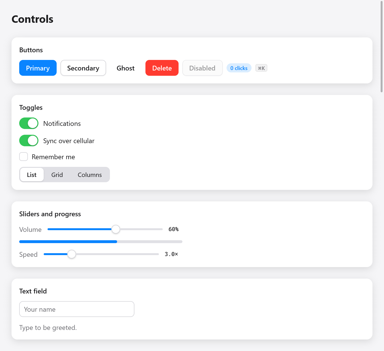
The Gallery controls with the light theme.
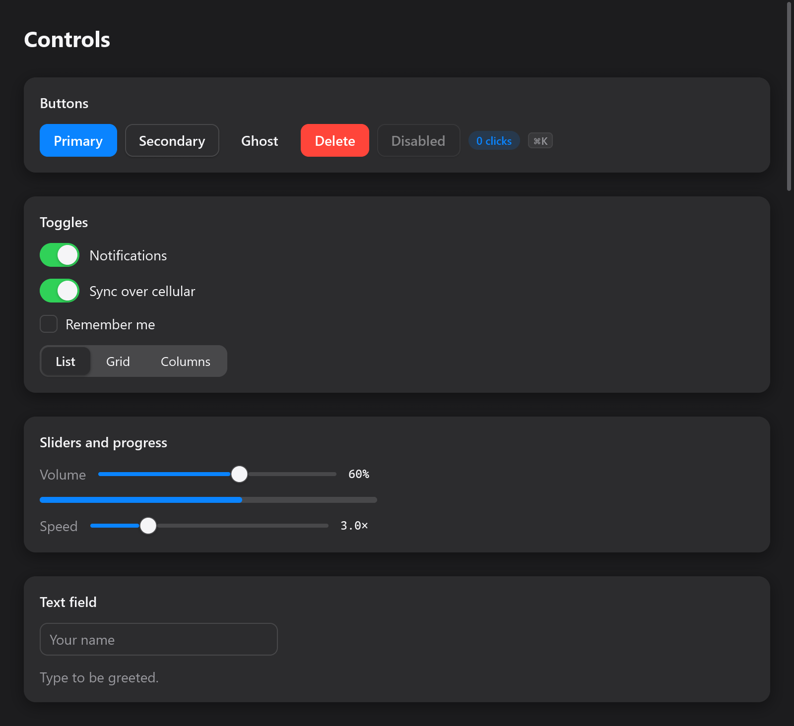
The same controls with the dark theme.
ui.column(c, .{
    .padding = .all(16),
    .gap = 8,
    .background = c.theme.surface,
    .border = c.theme.border,
    .radius = 12,
    .shadow = .{ .color = c.theme.shadow, .blur = 16, .y = 4 },
});
defer ui.end(c);
The look of a box
| field | what it draws |
|---|---|
background: ?Color | the fill, inside the rounded corners |
border: ?Color, border_width (1) | a border inside the box's edge |
radius | the corners' radius, in points; 1e4 (roundedFull()) makes a pill or a circle |
corners | how they curve: .circular (CSS's), or .continuous (continuous()), as macOS and iOS curve theirs |
shadow: ?Shadow | a Gaussian shadow: color, blur (its standard deviation, 12 by default) and y (its drop, 4) |
opacity | the box and its content together, 0 to 1 |
gradient: ?*const Gradient | linear, radial or conic colors over the background |
blur | blurs the box and its children as drawn (CSS's filter: blur()) |
effect: ?*const Effect | draws the box from what is under it (frosted glass) |
Continuous corners ("squircles", Core Animation's continuous corner curve and SwiftUI's rounded rectangles) leave the edges farther from the corner, about 1.53 times the radius, and bend gradually, so a card or a button looks as the system's do. They shape the box's background and border, its shadow, its picture (ui.image's corners), its gradient and what it clips, and every renderer draws them alike (the CPU and the GPUs). A backdrop effect keeps circular corners.
ui.card(c, .{ .radius = 18, .corners = .continuous, .shadow = .{ .blur = 18, .y = 6 } });
const tile = ui.div(c).w(64).h(64).rounded(14).continuous().bg(th.accent);
Gradients, blur, backdrop effects and transforms have a page of their own: transforms and effects. A gradient is kept until the frame is drawn, so pass a constant, the app's memory, or the frame's (c.alloc().create(ui.Gradient)).
Colors
ui.Color is sRGB with straight alpha, each channel from 0 to 1:
const blue: ui.Color = .hex(0x0a84ff);
const faint = blue.alpha(0.15);                 // multiplies its opacity
const between = c.theme.surface.mix(blue, 0.3); // 30% of the way to blue
const ink: ui.Color = .{ .r = 0.1, .g = 0.1, .b = 0.12 };ui.Color.white, .black and .transparent are constants.
For palettes, ui.oklch(l, c, h) makes a color in Oklch, as CSS's oklch(): lightness from 0 to 1, chroma from about 0 to 0.4, and hue in degrees. Colors of one lightness look equally light in it, so a palette of hues at one lightness and chroma stays even, and an accent's hover is the same hue a little darker. A color sRGB cannot show loses chroma, keeping its lightness and hue. ui.toOklch(color) goes back, as [3]f32.
const accent = ui.oklch(0.62, 0.19, 255);
const hover = ui.oklch(0.55, 0.19, 255);
State, not selectors
There are no selectors and no pseudo-classes: the view knows the state, and styles boxes from it. Hover, press and focus come from the box's interaction; c.animate eases a value toward a target, so a change of look is animated rather than abrupt:
const i = c.open(.{ .padding = .xy(12, 6), .radius = 6 }, null);
defer c.end();
const it = c.interact(i, .{});
const t = c.animate(it.id, 0, if (it.hovered) 1 else 0, 18);
c.node(i).style.background = c.theme.surface.mix(c.theme.surface_hover, t);
ui.div(...).hover(color) does this for a background. See custom widgets for interactions and motion for springs, keyframes and transitions.
Hover follows ancestry, as CSS's :hover does: a row is hovered while the pointer is over a button inside it, so a row that shows its buttons on hover keeps them while the pointer goes to them.
The theme
ui.Theme holds the colors every widget uses, and the fonts:
| field | used for |
|---|---|
dark | whether it is a dark theme |
background | the window |
surface, surface_hover | cards, fields, secondary buttons, and their hover |
text, muted | text, and secondary text (labels, placeholders) |
border | borders, dividers |
accent, accent_hover, accent_text | primary buttons, selection, focus rings, and text on the accent |
track, knob | sliders', switches' and progress bars' tracks and knobs |
danger, success | destructive actions and errors; done and on |
shadow | the color of shadows |
font, mono_font | font families, null for the system's (text) |
tooltip_delay | seconds the pointer rests before a tooltip shows; 0 is 0.6, negative at once (overlays) |
ui.Theme.light and ui.Theme.dark_theme are myzig's, after macOS's colors. A window uses one or the other as the system's appearance is, switching when it changes. To fix a window's colors, give it a theme:
var mine = ui.Theme.dark_theme;
mine.accent = .hex(0xff9f0a);
mine.font = "Inter";
_ = try app.newWindow(.{ .title = "Player", .theme = mine, .content = .{ .view = .init(&state, State.view) } });
Within the view, ui.themes.apply(c, theme) makes a theme the frame's (what widgets built after it read, and the window's background); call it first. myzig.isDark() and myzig.accentColor() read the system's appearance and accent outside a view.
Named themes
ui.themes.builtins lists myzig's themes by name: light, dark, light-high-contrast and dark-high-contrast. ui.themes.find(list, name) looks a name up in the app's own list first, then in myzig's, for a theme kept in settings by name:
const app_themes = [_]ui.themes.Named{
    .{ .name = "solarized", .theme = solarized },
};

fn view(s: *State, c: *ui.Context) void {
    if (ui.themes.find(&app_themes, s.theme_name)) |t| ui.themes.apply(c, t);
    // ...
}
ui.themes.forAppearance(dark, light_theme, dark_theme) picks the light or the dark one of a pair, ui.themes.withAccent(theme, color) gives a theme another accent (with its hover, and black text on it where white would not stand out, as on yellow), and ui.themes.mix(a, b, t) blends every color of two themes.
Switching themes, animated
ui.ThemeSwitcher (ui.themes.Switcher) changes from one theme to another with every color easing, as the system does when its appearance changes. Keep it in the state, change it with switchTo, and apply it first in the view:
const State = struct {
    dark: bool = false,
    theme: ui.ThemeSwitcher = .{},

    fn view(s: *State, c: *ui.Context) void {
        s.theme.apply(c);
        ui.column(c, .{ .padding = .all(20), .gap = 12 });
        defer ui.end(c);
        if (ui.toggle(c, "Dark", &s.dark))
            s.theme.switchTo(if (s.dark) ui.Theme.dark_theme else ui.Theme.light);
    }
};
Before the first switchTo the window's own theme shows. duration is 0.3 seconds by default; changing() tells whether a change is under way, and current() the theme shown now. Colors move nothing, so themes change smoothly even when the user asked for less motion.
The desktop's preferences
ui.preferences.apply(c), called first in the view, makes the frame follow the user's settings, and returns them as a ui.Preferences:
| field | from |
|---|---|
accent | the accent color the user chose, null where the desktop has none |
high_contrast | macOS's Increase contrast, Windows' contrast themes, a GTK high-contrast theme |
text_scale | Windows' text size, GTK's font resolution, 1 for usual |
reduce_motion | the system's reduced motion setting (see motion) |
The theme takes the accent and, with high contrast, borders and secondary text nearer the text's color (ui.preferences.highContrast(theme)); the text is scaled by text_scale through c.setZoom. The desktop is asked once per process; ui.preferences.refresh() asks again, for when it says its settings changed.
An app's own settings override the desktop's for the context: ui.preferences.setHighContrast(c, on), setTextScale(c, scale) and setAccent(c, color), each taking null to follow the desktop again. ui.preferences.get(c) reads what the frame follows without applying it.
fn view(s: *State, c: *ui.Context) void {
    if (s.big_text_changed) ui.preferences.setTextScale(c, if (s.big_text) 1.3 else null);
    const prefs = ui.preferences.apply(c);
    _ = prefs;
    // ...
}