
Forms
Fields label controls, show a description or an error below them, and name them for assistive technology. A form lines up the labels of its fields in a column of their own; a fieldset groups fields under a legend and can disable them together; ui.validate checks values.
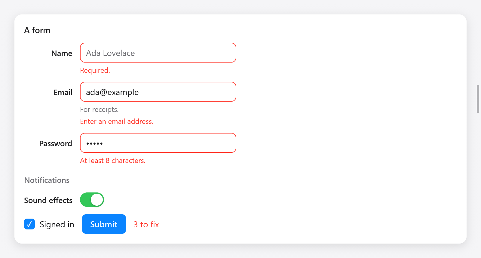
A submitted form showing required-field, email and password validation errors.
Fields
ui.field(c, title, options) labels the control built next, the label above it as on the web, and returns a ui.Field to end once the control is built:
const f = ui.field(c, "Email", .{ .description = "For receipts.", .err = ui.validate.email(s.email.text()) });
_ = ui.textField(c, &s.email, .{ .width = .{ .px = 260 } });
f.end();ui.FieldOptions:
| field | what it shows |
|---|---|
description | a text below the control, in the muted color |
err | what is wrong with the value, below the control in the danger color, which the control's border takes; empty is valid |
A click on the label focuses the control. The control's accessible name is the label, its description the error (or the description), and it is marked invalid while there is an error. Any control works: a text field, a select, a switch, a date input; the field finds the first control built after its label.
Forms
ui.form(c, options) puts the labels of its fields in a column beside the controls, aligned to the right, as wide as the widest label, and level with the first line of their control's text, as macOS's settings do (or with the middle of a control without text, as a switch, a description below it or not, and in a row with the text beside a dot or an icon: Style.baselines). Keep the form in a variable (its fields change it) and make the fields with its own field:
var fm = ui.form(c, .{});
{
    defer fm.end();
    const n = fm.field("Name", .{});
    _ = ui.textField(c, &s.name, .{ .placeholder = "Ada Lovelace", .width = .{ .px = 260 } });
    n.end();
    const p = fm.field("Password", .{ .err = ui.validate.minLength(c, s.password.text(), 8) });
    _ = ui.textField(c, &s.password, .{ .password = true, .width = .{ .px = 260 } });
    p.end();
    const snd = fm.field("Sound effects", .{});
    _ = ui.toggle(c, "", &s.sounds);
    snd.end();
}ui.FormOptions: gap (12, between fields) and label_gap (12, between the labels' column and the controls'). The labels' width is measured as the form is built; when it changes, the frame is built again at once, so no frame shows the labels unaligned.
Fieldsets
ui.fieldset(c, legend, options) groups fields under a legend. With disabled, the fields are dimmed and take no input: a box over them takes every press, and the keyboard focus leaves them. End it with end:
const set = ui.fieldset(c, "Notifications", .{ .disabled = !s.signed_in });
const snd = fm.field("Sound effects", .{});
_ = ui.toggle(c, "", &s.sounds);
snd.end();
set.end();ui.FieldsetOptions: disabled and gap (12). A fieldset can hold the fields of a form (as above, between a form's field calls) or plain ui.fields.
Validation
ui.validate has checks that return the error to show, empty when the value is valid, ready for a field's err:
| check | error |
|---|---|
required(s) | "Required." for an empty or blank value |
email(s) | "Enter an email address." unless it looks like one (empty is valid) |
minLength(c, s, n) | "At least n characters." for fewer than n characters (empty is valid) |
number(c, s, lo, hi) | "Enter a number." or "Between lo and hi." (empty is valid) |
first(errors) | the first non-empty one of several checks |
Combine required with another check for a value that must be given:
.err = ui.validate.first(&.{ ui.validate.required(s.email.text()), ui.validate.email(s.email.text()) }),ui.Validation counts a form's errors, to enable its submit button or say how many are left: check(err) passes an error through, counting it, and ok() tells whether there were none.
fn form(s: *State, c: *ui.Context) void {
    var v: ui.Validation = .{};
    var fm = ui.form(c, .{});
    {
        defer fm.end();
        const n = fm.field("Name", .{ .err = if (s.submitted) v.check(ui.validate.required(s.name.text())) else "" });
        _ = ui.textField(c, &s.name, .{ .width = .{ .px = 260 } });
        n.end();
        const e = fm.field("Email", .{ .err = v.check(ui.validate.email(s.email.text())) });
        _ = ui.textField(c, &s.email, .{ .width = .{ .px = 260 } });
        e.end();
    }
    ui.row(c, .{ .gap = 12, .align_items = .center });
    defer ui.end(c);
    if (ui.button(c, "Submit", .{ .variant = .primary }).clicked) s.submitted = true;
    if (s.submitted) ui.text(c, if (v.ok()) "All good." else c.print("{d} to fix", .{v.errors}), .{
        .color = if (v.ok()) c.theme.success else c.theme.danger,
    });
}
Show errors of empty required fields only once the user tried to submit, as above, and errors of what was typed at once. Errors are strings in English; for other languages, write your own checks (any function that returns a string works) with messages from i18n.